Vertical Harvest had proven their dual-mission concept locally: growing food and futures through innovative vertical farming and integrated disability employment. With two operational farms, a completed Series A, and a national expansion pipeline, they were ready to scale. One question loomed: how do you convince skeptical investors and partners that vertical farming can scale profitably in a category plagued by high-profile failures?
Their website wasn't architected to serve radically different audiences simultaneously. Investors couldn't see the operational advantage. Distributors couldn't assess reliability. Consumers had no reason to reach for the product over its neighbors on the shelf.
Vertical Harvest had two powerful stories. Their Grow Well employment mission inspired deep loyalty. Their product quality and hyper-local freshness drove purchase. The challenge wasn't choosing between them. It was architecting when each message should lead and where the other played a supporting role.
The objective: build a digital experience where mission and margin don't compete. Where design becomes the strategic bridge between radically different audiences for a radically fresh brand.
Every decision was guided by four goals:
Accessibility without aesthetic compromise. Full ADA compliance proving accessible design and bold design aren't mutually exclusive.
Discovery: Understanding the Audience Divide
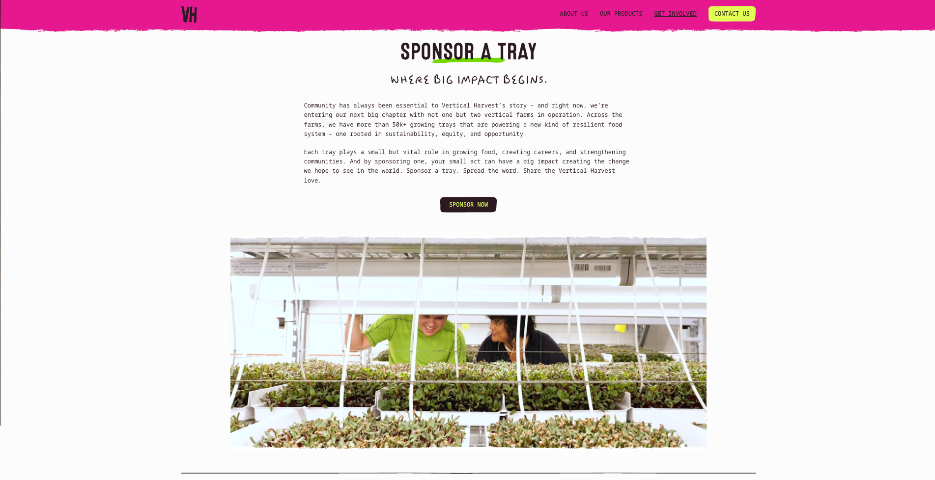
We initiated the process with comprehensive stakeholder discovery and competitive analysis of both the vertical farming landscape and premium produce brand successes.
The research confirmed what Vertical Harvest already understood: their dual-mission model was a genuine differentiator. But it also revealed that radically different audiences needed to encounter that story in radically different ways. Capital partners needed proof the model created operational advantages, not just feel-good PR. Channel partners were evaluating reliability, margin, and whether the brand could hold its own against established suppliers. Consumers standing at the refrigerated case made decisions in seconds, not sentences.
Across every audience, the same dynamic held: product quality hooked them. The employment model was why they stayed. The mission wasn't a problem. It was an unmatchable operational advantage being undersold.
Strategy: Architecting When Each Message Leads
We developed positioning that kept "growing food and futures" central to Vertical Harvest's identity while architecting the messaging hierarchy for each audience. "Good Tastes Great" became the unifying thread: doing good doesn't sacrifice product quality.
Design: Visual Architecture as Business Strategy
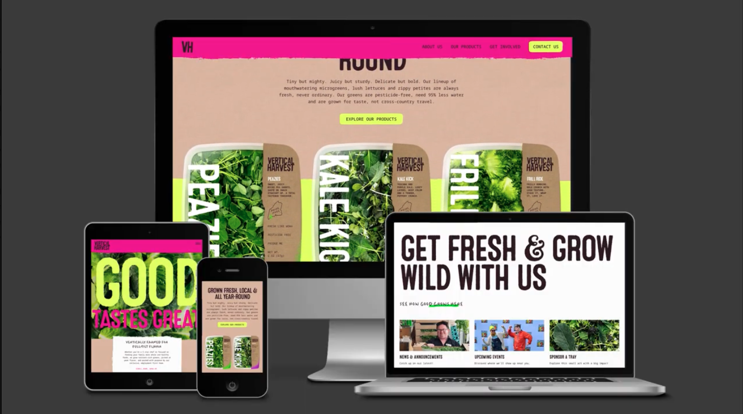
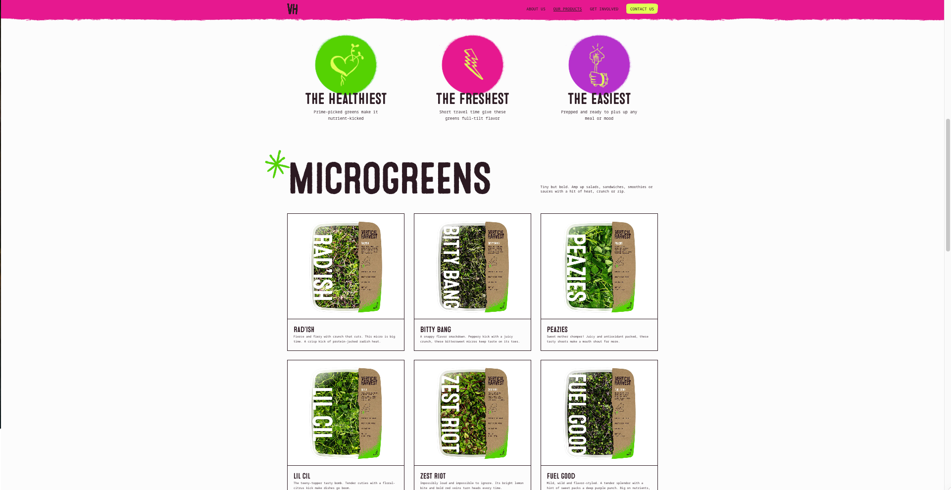
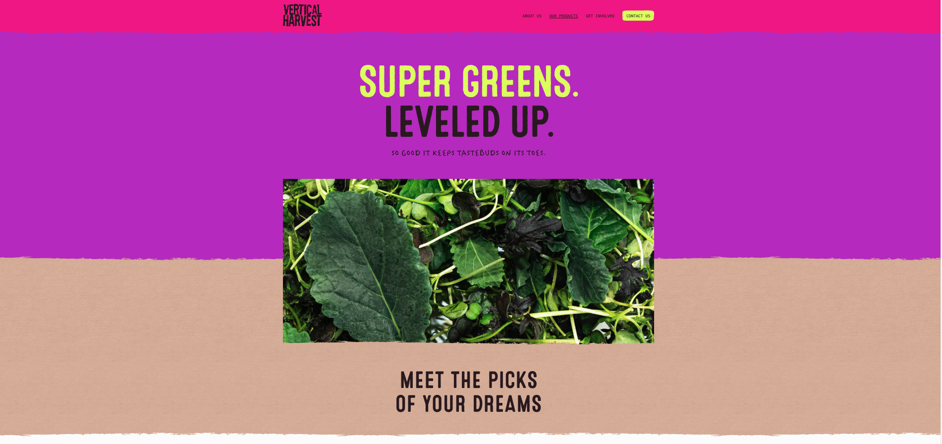
Visual design became strategic architecture, not decoration. We established a bold, contemporary direction communicating premium quality through full-screen video and category-specific color coding that created intuitive navigation and doubled as brand equity. Typography hierarchy balanced Vertical Harvest's irreverent personality with the readability demands of a dual B2B and B2C audience.
Interactive Design: Micro-Interactions That Told the Macro Story
We developed signature interactions that were narrative, not decorative. Product packaging hover states triggered simultaneous 3D tilt, reflecting the brand's irreverent confidence. A scroll-triggered header animation condensed the full "Vertical Harvest" wordmark to the "VH" monogram, balancing brand presence with usability. Arcing culinary carousels with hover-triggered expansion created conversion-serving delight throughout the discovery path.
Content Architecture: One Experience, Three Key Audiences
Rather than building separate site sections that would fragment the narrative, we mapped distinct user journeys and created modular content with intelligent layering. One cohesive experience serves three audiences. Capital partners see operational advantage. Channel partners see a differentiated brand worth stocking. End consumers discover fresh, local produce and return because of the mission.
Every touchpoint maintained mission integrity while letting product quality carry the conversation.
The new Vertical Harvest website transformed a powerful dual-mission model into a single, unmistakable competitive advantage. Connecting with every audience, simultaneously.
The site launched as the brand's most powerful sales tool. Where the previous site presented the story with competing messages, the new experience maintained mission integrity while letting product quality carry the conversation. That tension was always the point. And the proof of Vertical Harvest's differentiation.
Investor engagement: The redesigned digital presence directly supports active fundraising. Capital partners now independently validate the Grow Well operational advantage before a single pitch meeting. The site reframes vertical farming investment from category risk to defensible moat.
B2B/channel connection: Distributor and retail partners encounter a site built around their decision-making language: reliability, supply consistency, premium positioning. The mission layer then differentiates Vertical Harvest from every commodity competitor on the shelf.
User engagement: Product packaging hover states turned browsing into discovery. Simultaneous 3D tilt, category-coded underline swoosh, and SVG asterisk pop gave users a reason to stay and explore every product on the page.
Most critically, Vertical Harvest now has a digital presence that works as efficiently as their farming technology: one integrated system delivering consistent value across every stakeholder interaction. The site doesn't just communicate the story. It proves the thesis. You don't choose between mission and market. You lead with what hooks customers, then let the mission keep them. Good Tastes Great.