We partnered with ŌURA—a leader in the health wearables space—to reimagine their app experience with a data visualization system that transforms the Oura Ring’s always-on biometrics into insights members can quickly understand, compare, and act on across both daily moments and long-term health patterns.
The Challenge
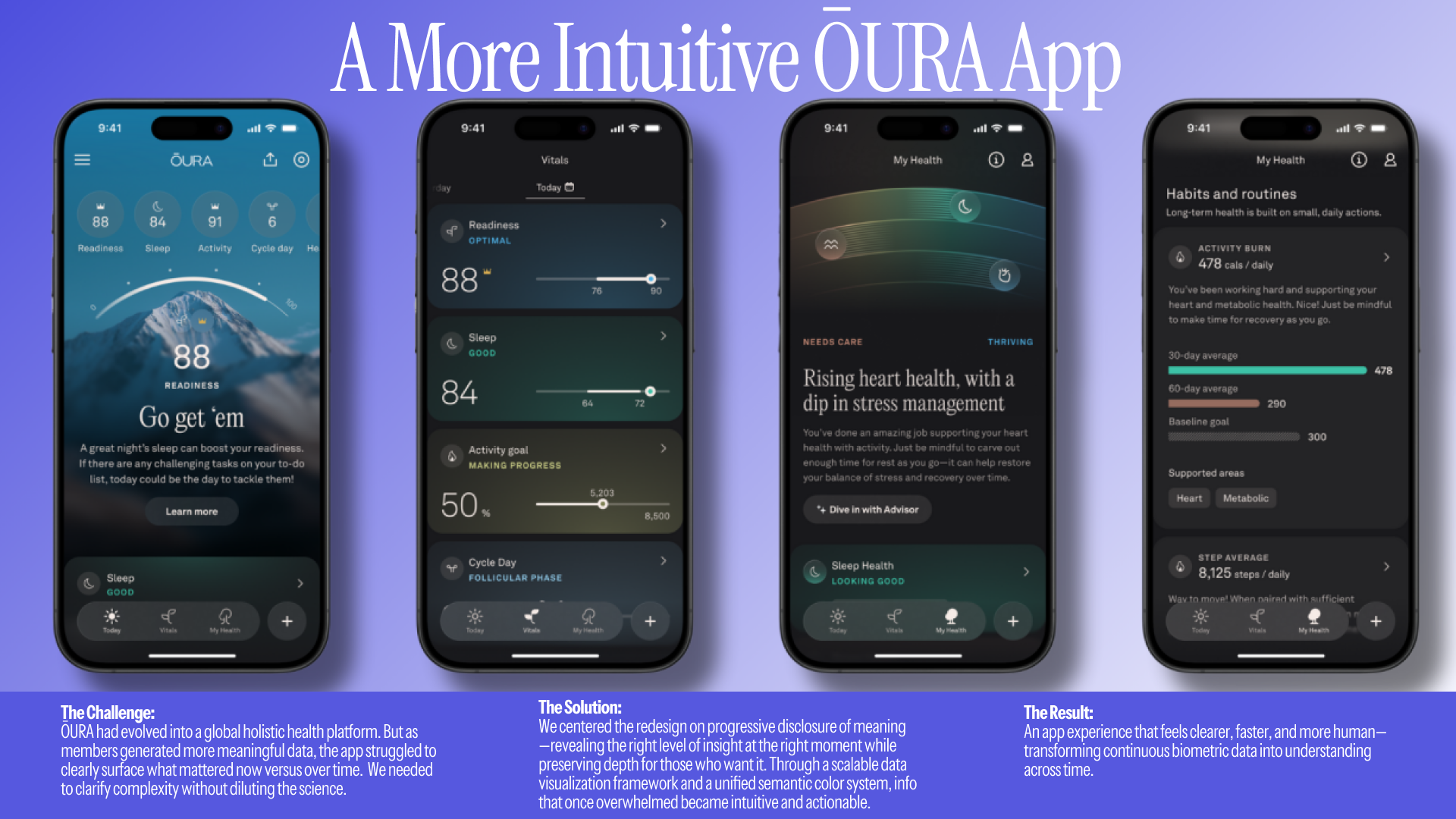
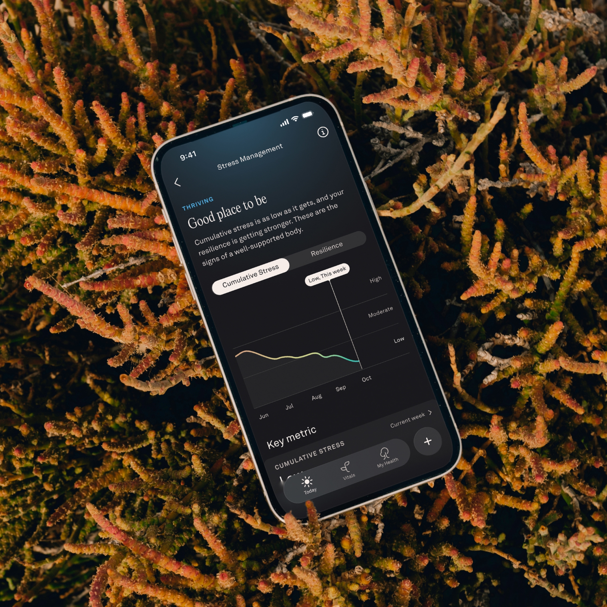
ŌURA members generate over 50 health metrics daily, spanning sleep, readiness, stress, and long-term resilience. As the platform expanded from sleep into holistic health, data volume and complexity grew—but the app experience struggled to surface what mattered now versus over time. Valuable insights were buried beneath increasing density, making it harder to interpret health, build habits, and stay engaged.
The challenge was not collecting data, but making it legible. As the volume and variety of health metrics grew, members needed a way to understand what mattered now, recognize patterns over time, and explore detail without becoming overwhelmed.
We asked: how can health data preserve scientific depth while making meaning immediately clear?
Visualizing clarity at scale
Our solution centers on a three-level visualization framework designed to balance immediacy and depth:
This layered structure allows members to move fluidly between intuition and precision, depending on their needs.
Color as a functional design system
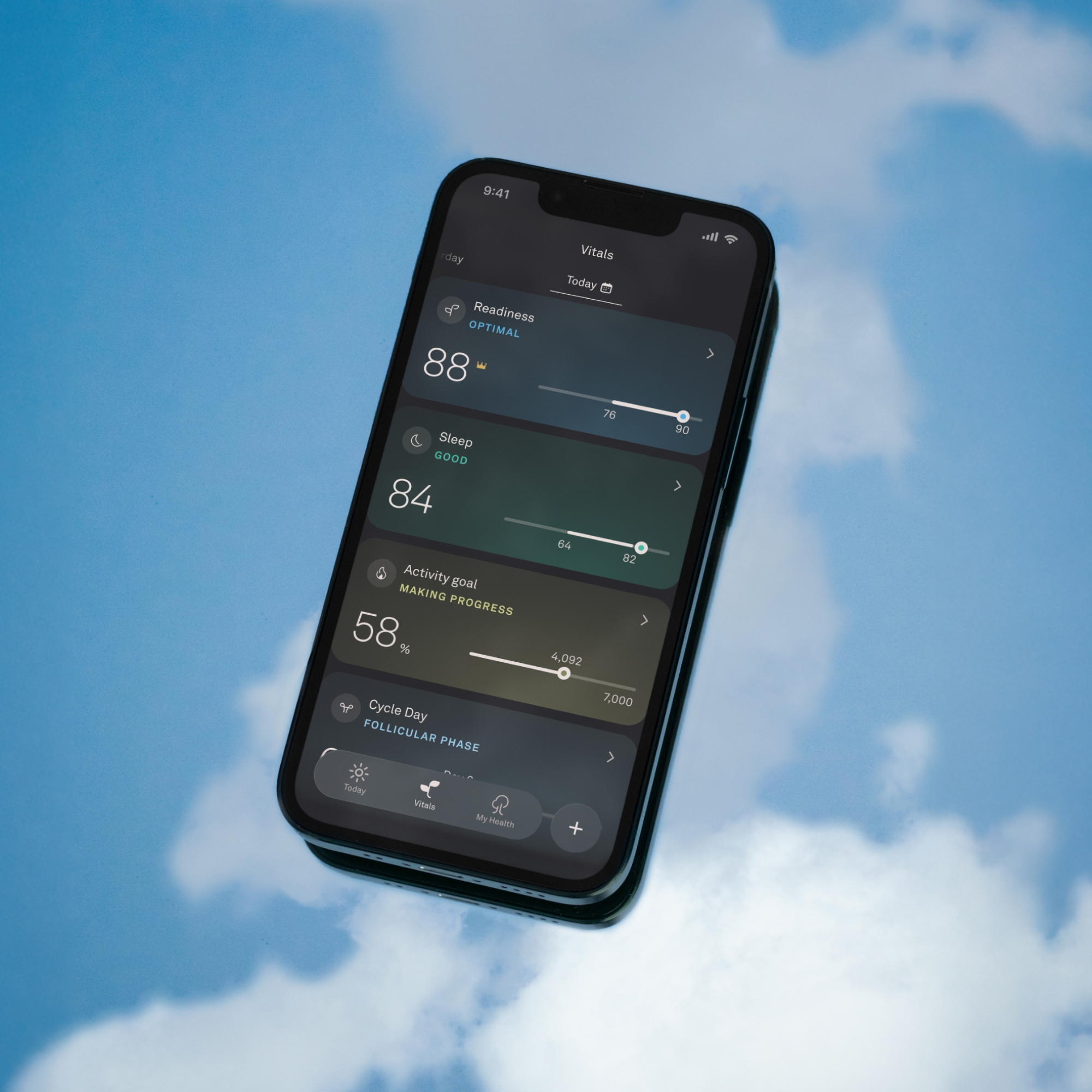
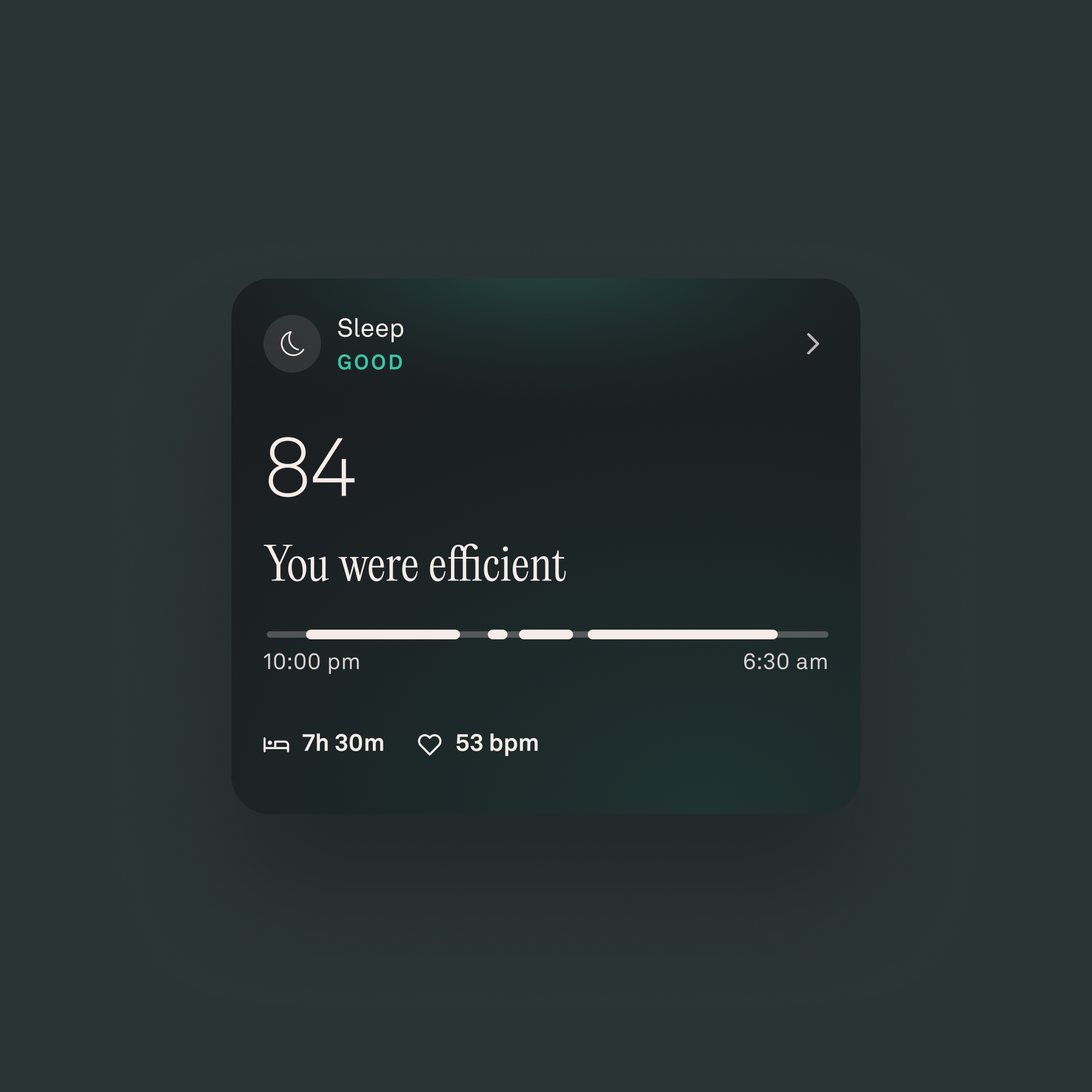
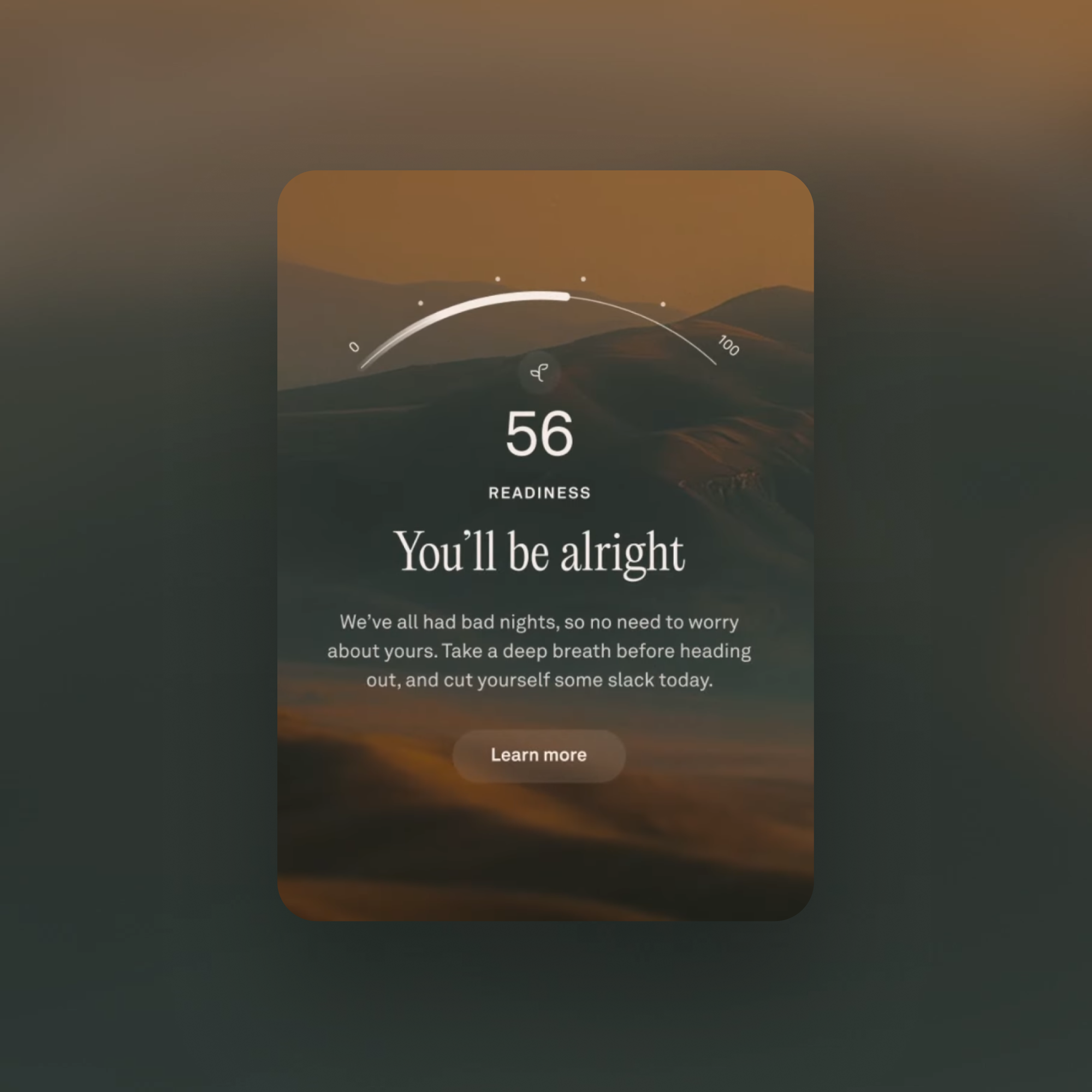
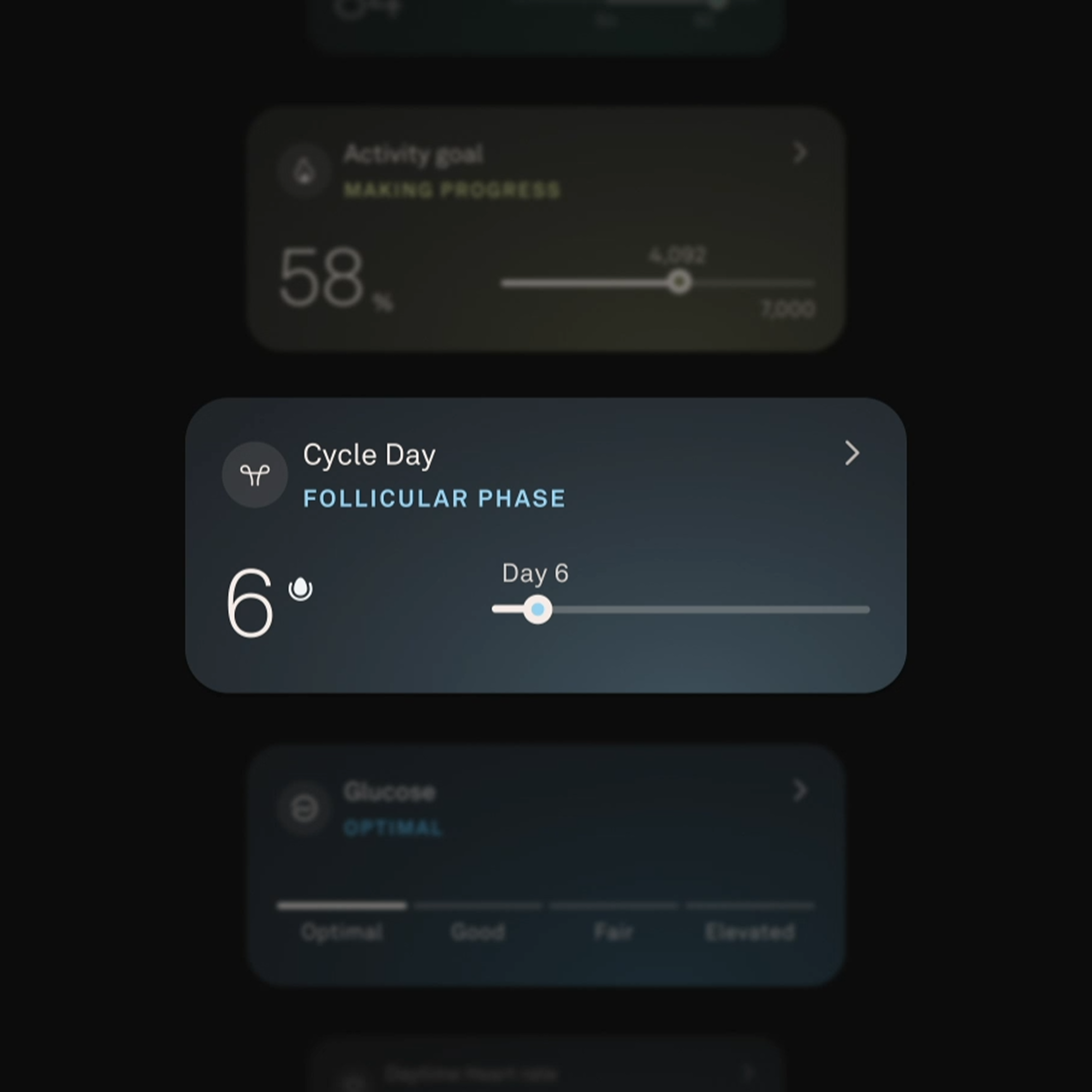
A unified, semantic color system enables immediate interpretation across all views. Color adapts to personalized baselines, signaling how the body is responding rather than simply displaying raw values. This consistency allows members to scan, compare, and recognize patterns across metrics without relearning visual cues.
Whether checking morning readiness or examining cardiovascular trends over time, color reinforces meaning and reduces cognitive effort.
Progressive disclosure
We designed the app based on how people actually move through their day, prioritizing information from morning to night, informed by rigorous user research and usability testing. The app serves as an extension of the ring—mirroring its premium, minimalist design—while structuring insight through progressive disclosure of meaning.
Layered views translate continuous sensing into immediate clarity and long-term understanding, ensuring depth without overwhelm. Surface-level views provide sufficient information for most interactions, but if members need more detail, additional layers reveal themselves one tap away.
Designing for moments, not metrics
We balanced utility and expression to strengthen comprehension while maintaining a calm, human visual language. Clear hierarchy prioritizes daily relevance, supports pattern recognition, and encourages exploration.
The Impact
Restrained visual language and clear information hierarchy ensure the interface stays out of the way, allowing insights—not the UI—to take focus. The connected experience makes the device meaningful: the ring senses continuously, and the app translates those signals into understanding.
The redesigned system makes health data more accessible and actionable, helping members understand their full health picture, explore trends over time, and make informed decisions. What was once overwhelming becomes actionable, and the app feels lighter, faster, and more human than ever—even as its underlying intelligence grows more sophisticated.
Doug Sweeny, CMO, ŌURA: “The clean new design keeps everything you love about ŌURA, but adds more clarity and simplified intuitive navigation. The My Health tab allows you to understand your specific health strengths and opportunities at a glance, while seeing how your habits tie into the bigger picture of your long-term health.”
Post Launch Ratings, Customer Sentiment
"Best app I ever had for tracking health" — Robert Knight, ŌURA App User
"I love this app, I am more in control of my well being and have more control on my stress levels." — Netta Mosseri, ŌURA App User
“The app provides great insights and helps me decide what is best for me each day.” — Roxanne El Baff, ŌURA App User