Brisbane Airport’s 100th anniversary marked a defining moment in its history – not just a milestone to celebrate, but an opportunity to reposition the airport for the next century.
The objective of this project was to create a refreshed brand identity for the precinct that honoured Brisbane Airport’s heritage while clearly signalling a new era of growth, transformation and optimism.
With major domestic and international terminal upgrades already underway and the Future BNE transformation program well advanced, the new brand needed to reflect the scale of change already in motion. Our goal was to develop a brand that felt contemporary, dynamic and forward-looking, while retaining the strong legacy and trust built over decades.
The brand refresh was designed to achieve three core goals:
Importantly, the objective was not to distract from the passenger experience, but to complement it by ensuring the brand acted as a clear, consistent signal of progress alongside tangible improvements in infrastructure and service.
The brand refresh was developed through a collaborative approach, ensuring strategic clarity, creative impact and operational practicality across a complex airport environment.
Working closely with Traffic Brand Agency, the project began with an assessment of Brisbane Airport’s history, its evolving role within the city and state and the future vision outlined by Future BNE. The creative idea centred on movement, possibility and connection, core elements of aviation that also reflect Brisbane’s growing energy and ambition.
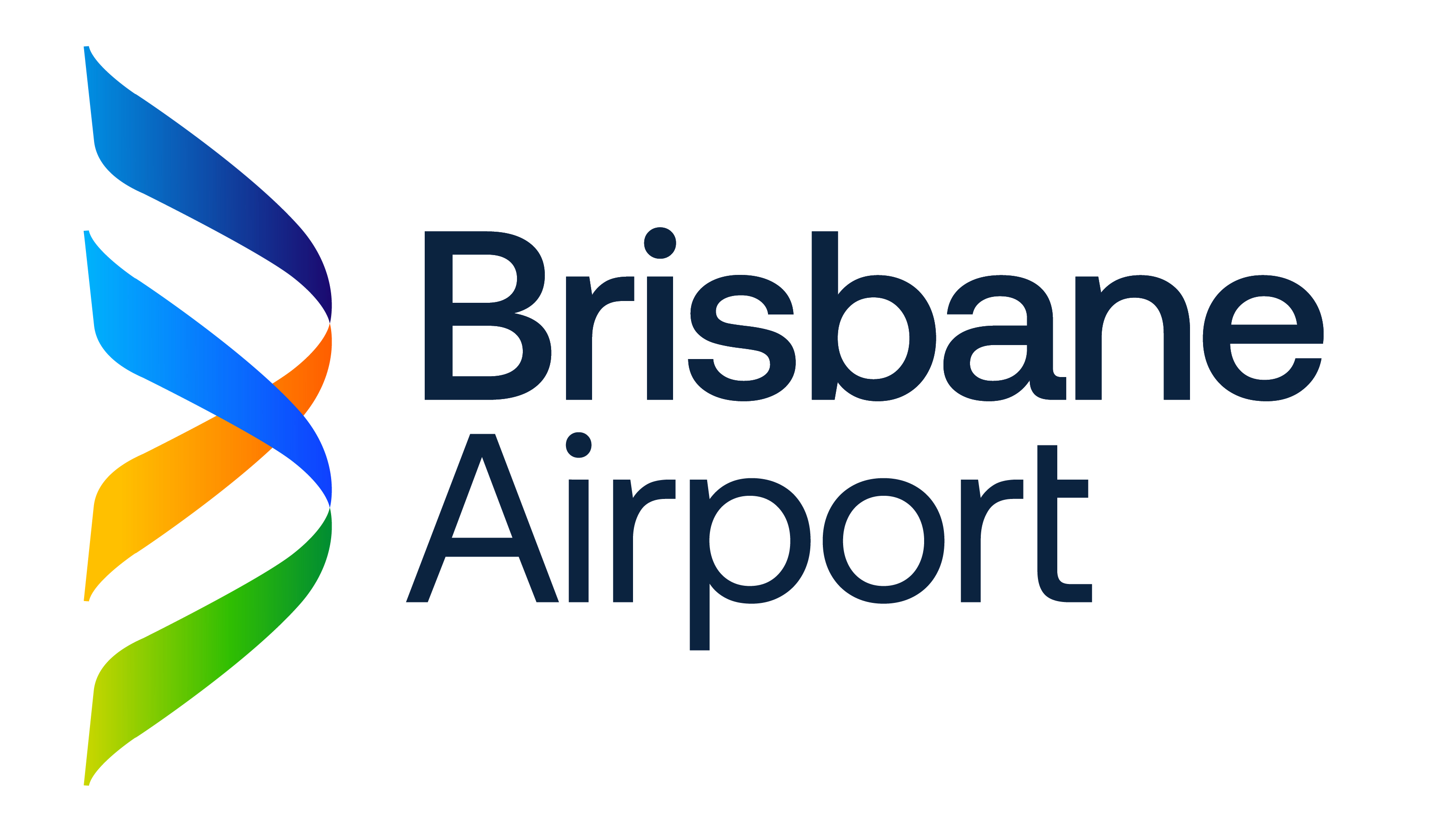
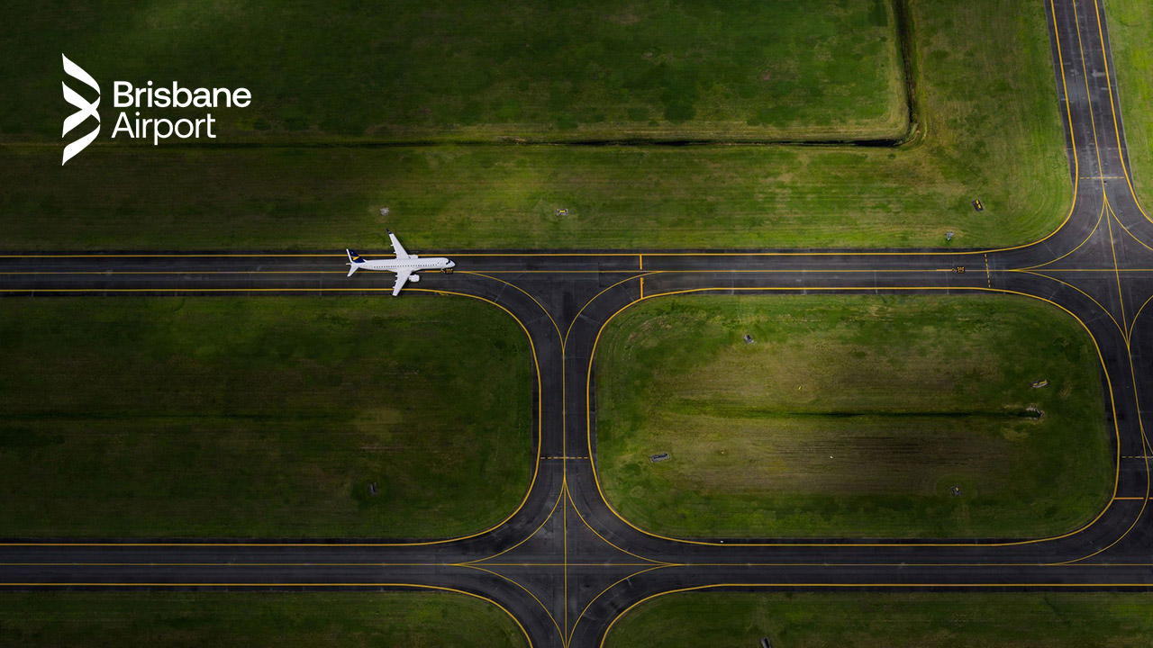
A key strategic shift was replacing the IATA code BNE with the full name Brisbane Airport to create a more human, accessible and globally recognisable identity. The traditional square logo was replaced by a dynamic brandmark – flowing ribbons that form a stylised ‘B’, inspired by jet streams and condensation trails that evoke a sense of moving forward with freedom.
These ribbons follow a colour gradient that reflects the transformation from land to sea to sky, mirroring the experience of flight. While secondary colours echo the tones of the Queensland landscape including sky blue, ocean blue, sunshine yellow, sunrise orange and field green.
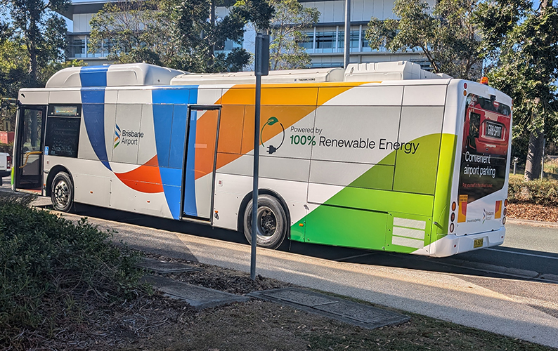
Beyond the logo, a flexible ‘bento’ design system was created which allows the brand to work seamlessly across digital signage, wayfinding, social media, and online platforms, while maintaining clarity in high-pressure, information-heavy environments. The bento design system draws inspiration from the dynamic shapes of the airport apron, forming containers for essential information and designed for legibility.
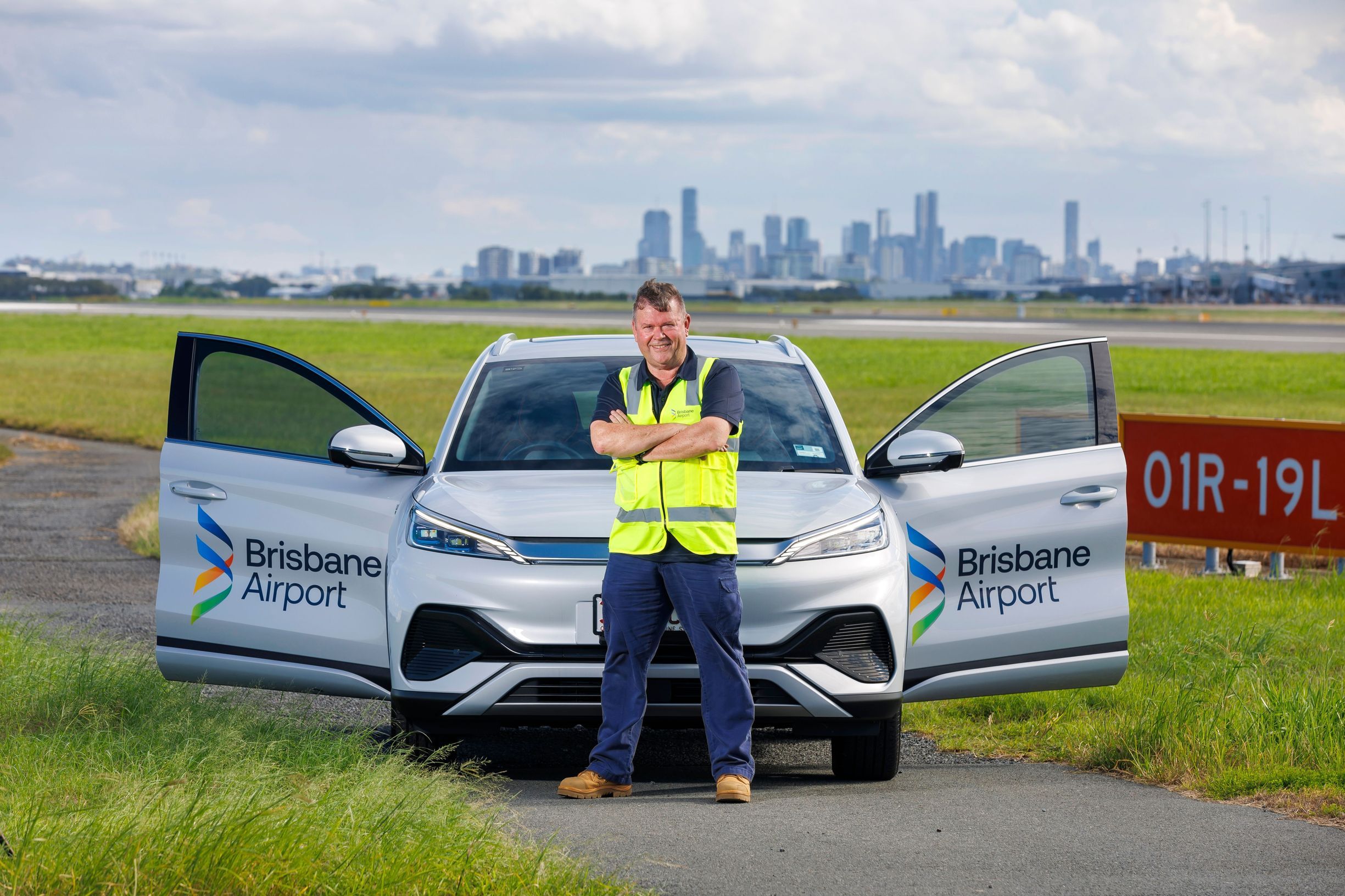
One of the most significant challenges was the scale of the rebrand. Brisbane Airport is a live, operational precinct with thousands of branded touchpoints accumulated over decades – uniforms, signage, online assets to name just a few.
Removing and replacing legacy branding required careful coordination, prioritisation and internal engagement. Rather than treating this as a purely operational task, the team turned it into a cultural movement by encouraging staff to help find old logos across the precinct, fostering ownership and excitement. An internal competition allowed employees to share photos through an internal communications channel.
Balancing heritage with innovation was another key challenge. The solution was not to erase the past, but to reinterpret it – retaining recognisable elements while giving them renewed relevance. This approach ensured long-term brand continuity while delivering a clear visual shift.
The refreshed Brisbane Airport brand successfully met its objectives by clearly positioning the airport for its next chapter while respecting its 100-year legacy.
The new identity has been positively received across key audiences, from passengers and airline partners to internal teams measured by anecdotal feedback and online mentions. The brand’s sense of movement, optimism and clarity aligns strongly with Brisbane Airport’s physical transformation, reinforcing confidence in the airport’s future direction.
Internally, staff embraced the refresh as a symbol of pride and progress, with strong participation in the rollout process and a renewed sense of connection to the airport’s role in the region. This internal buy-in has been critical to embedding the brand across such a large and diverse workforce.
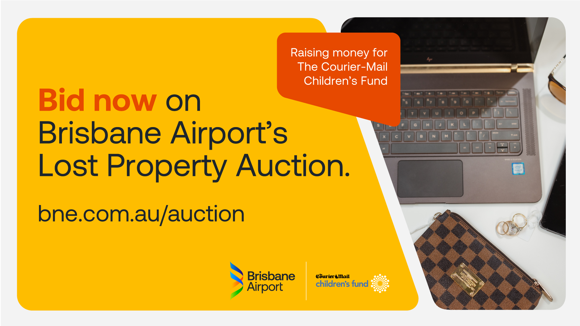
Externally, the brand now provides a cohesive, contemporary visual system that works effectively across terminals, digital platforms and communications – supporting wayfinding, storytelling and destination marketing in equal measure. Recent community reputation research shows 54% of the general community has a positive impression of Brisbane Airport (slightly up from 52% in the 2024 results conducted pre-brand launch). The brand rollout is at 80%, with final project work over the next 18 months such as recycling uniforms through circular economy initiatives.
Ultimately, the project is considered a success because it delivered more than a new logo. It created a unifying symbol of momentum at a pivotal time, sending a clear message that Brisbane Airport is not only celebrating where it’s been, but confidently shaping where it’s going next.