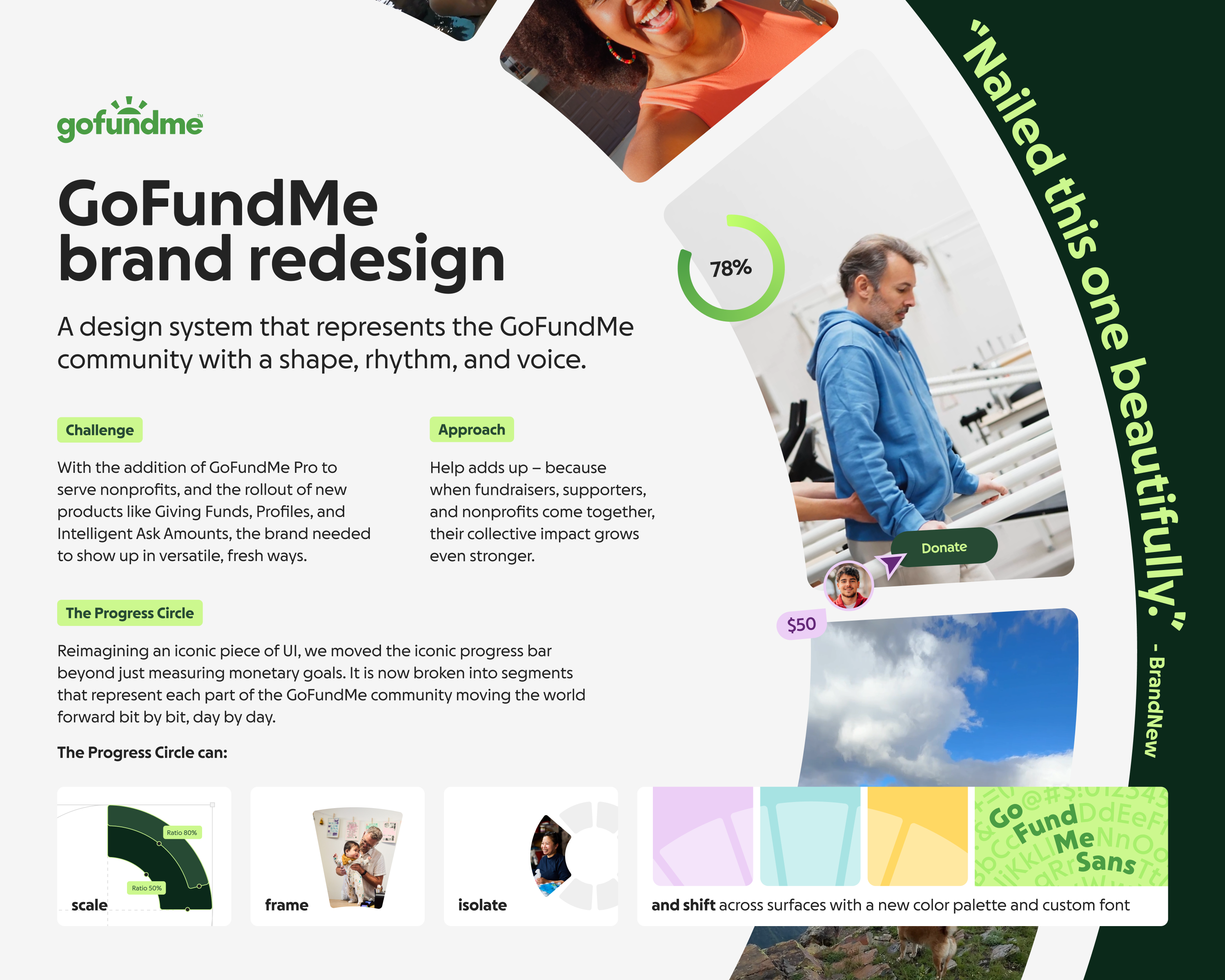
GoFundMe has grown beyond individual giving into a broader ecosystem spanning personal and nonprofit giving. With the addition of GoFundMe Pro to serve nonprofits, and the rollout of new products like Giving Funds, Profiles, and Intelligent Ask Amounts, the brand needed to show up in versatile, fresh ways.
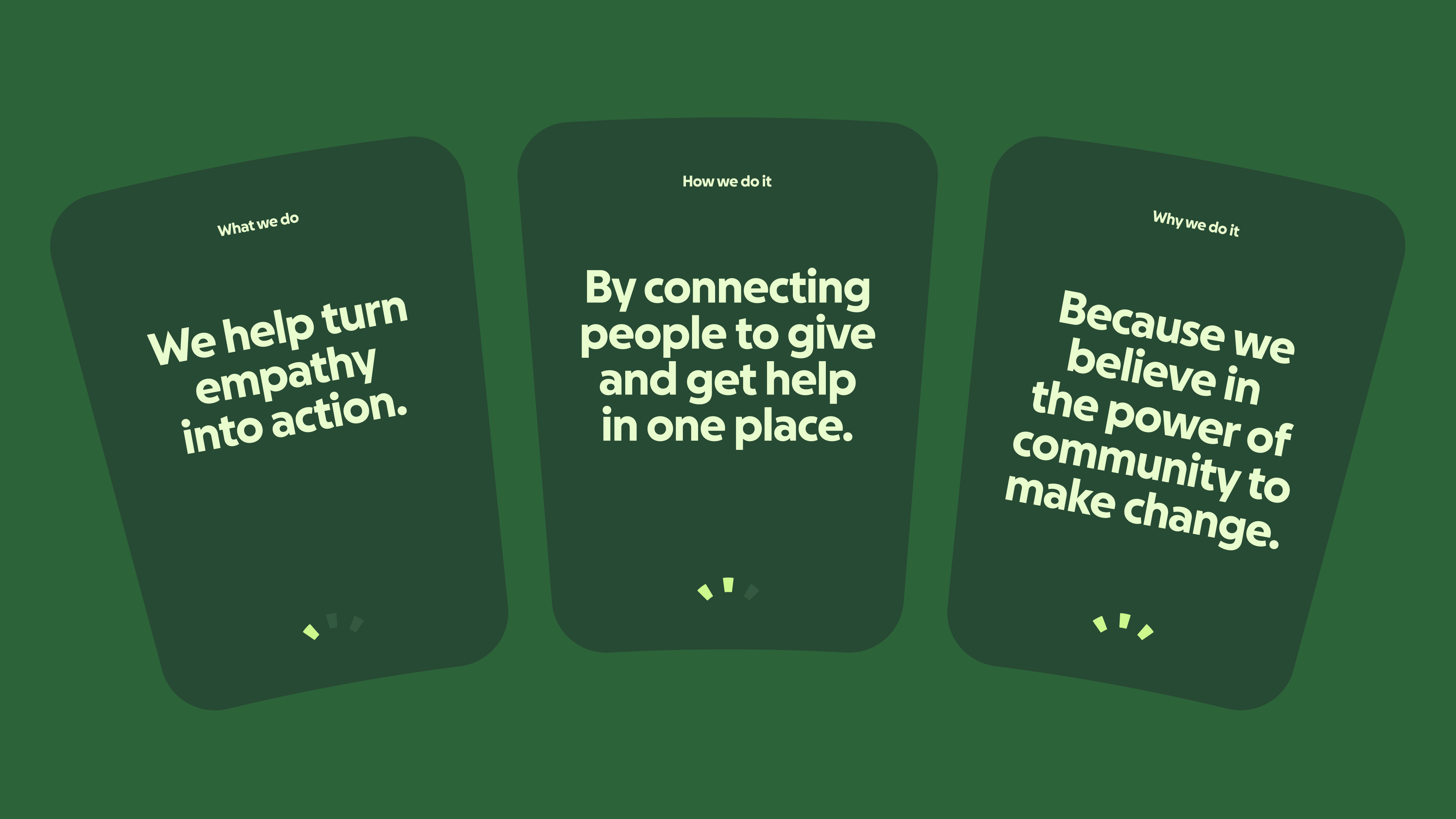
The design strategy centered on the idea that help adds up – because when fundraisers, supporters, and nonprofits come together, their collective impact grows even stronger.
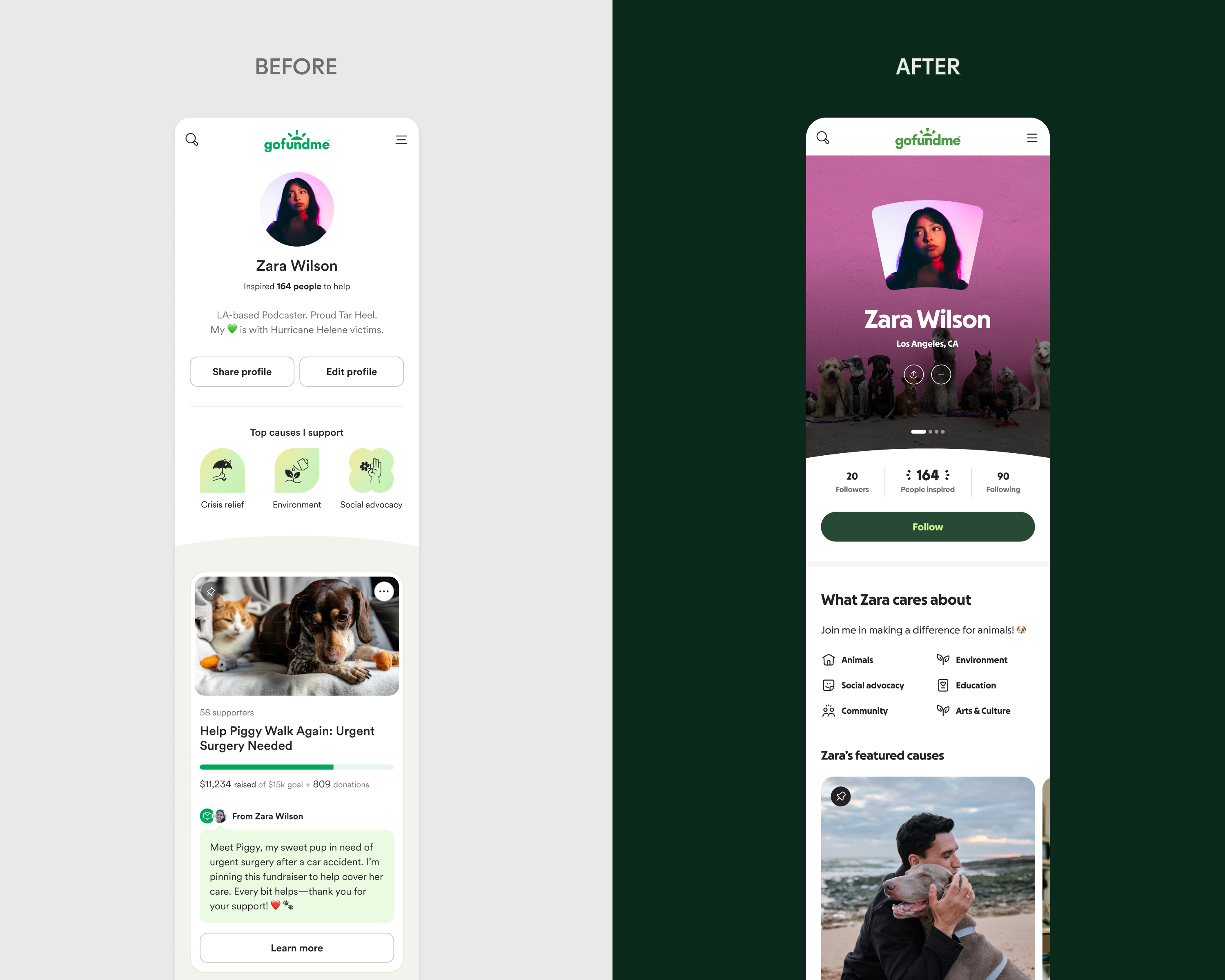
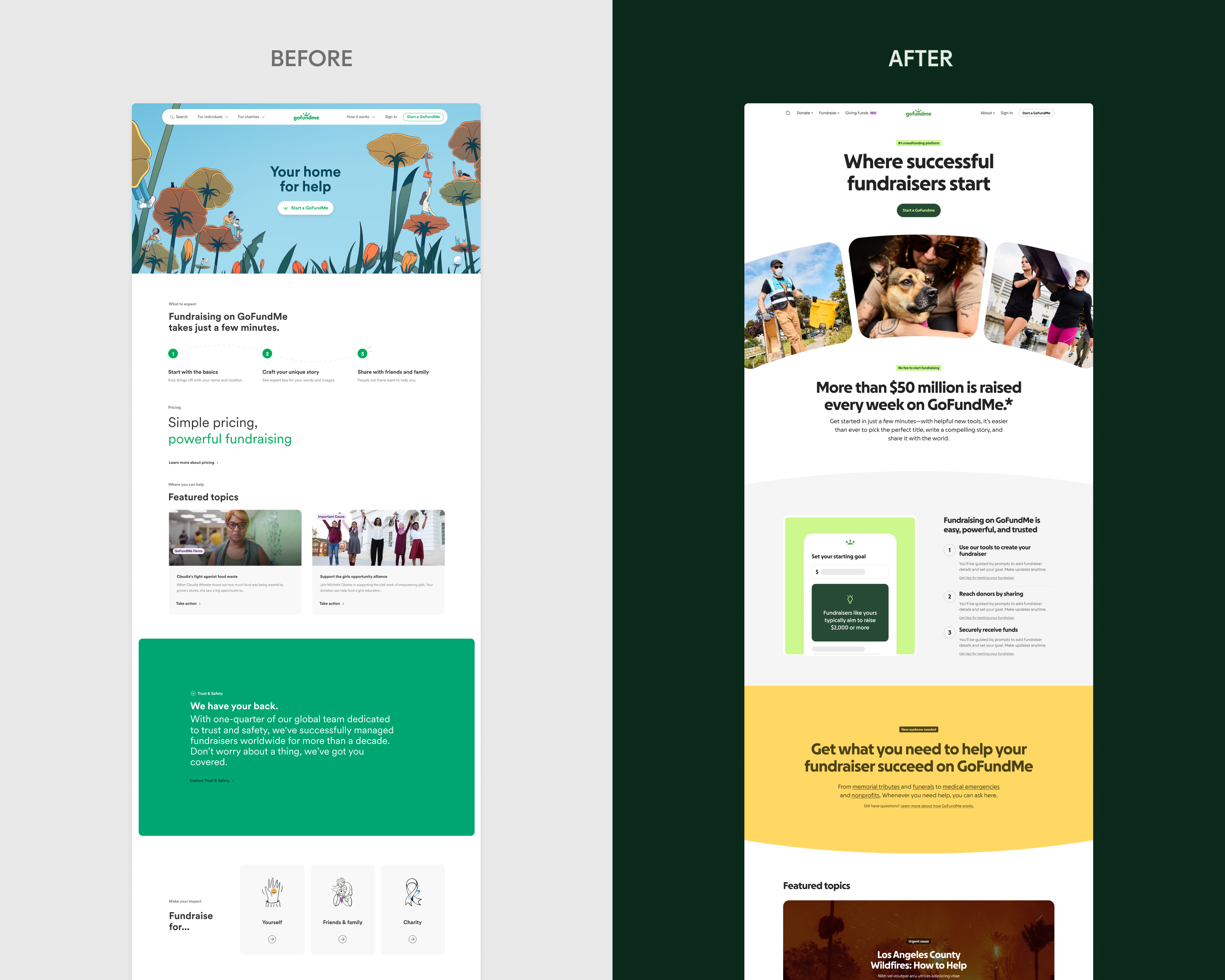
At the heart of the system, the Progress Circle: a graphic device inspired by the fundraiser progress indicator that has been part of GoFundMe since day one. Moving beyond just a way to measure monetary goals, progress is now broken into segments that represent each part of the GoFundMe community moving the world forward bit by bit, day by day.
Reimagining and reinvigorating an iconic piece of UI,, the Progress Circle can now scale, frame, isolate, and shift across applications while remaining unmistakably consistent. Beyond just a marketing device, it also drove a major shift in product design and became a shared visual language throughout the brand.
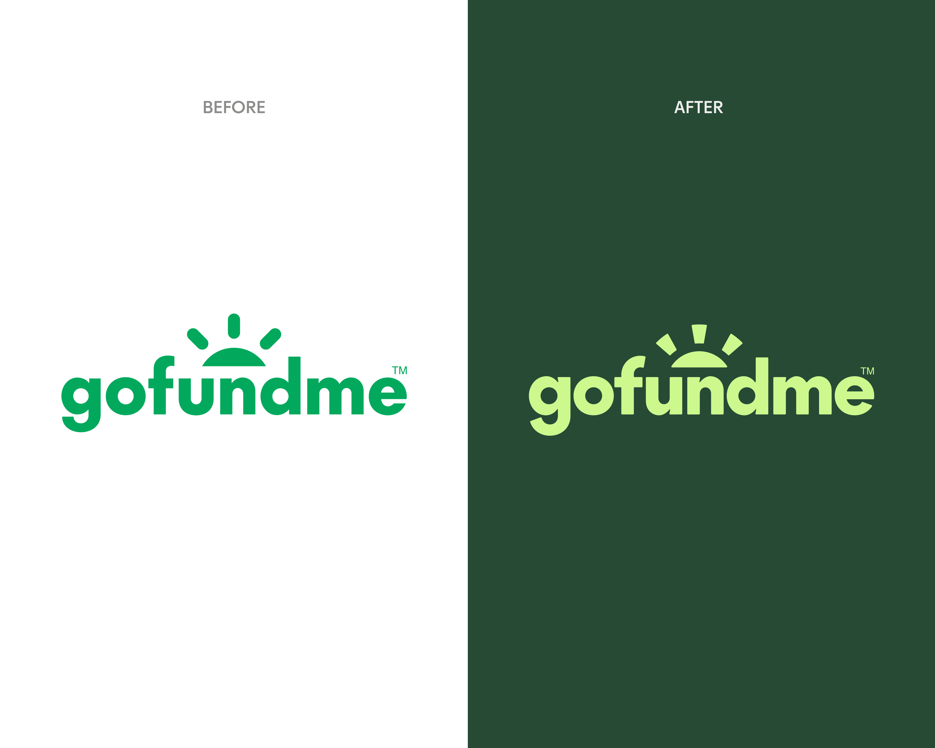
Extending into the logo, the Progress circle segments were created from the sun that sits atop the wordmark. GoFundMe Pro - the GoFundMe offering built specifically for nonprofits - was created from the same updated wordmark, which adds bold, more confident curves to draw a stronger connection to the greater system and establishes a clear, cohesive brand architecture.
Color became more vibrant but remained rooted in green, a nod to GoFundMe’s grassroots origins. Supporting hues expanded the palette into a hopeful spectrum – bringing trust, optimism, compassion, and dignity with a duotone approach that offers far greater legibility and accessibility.
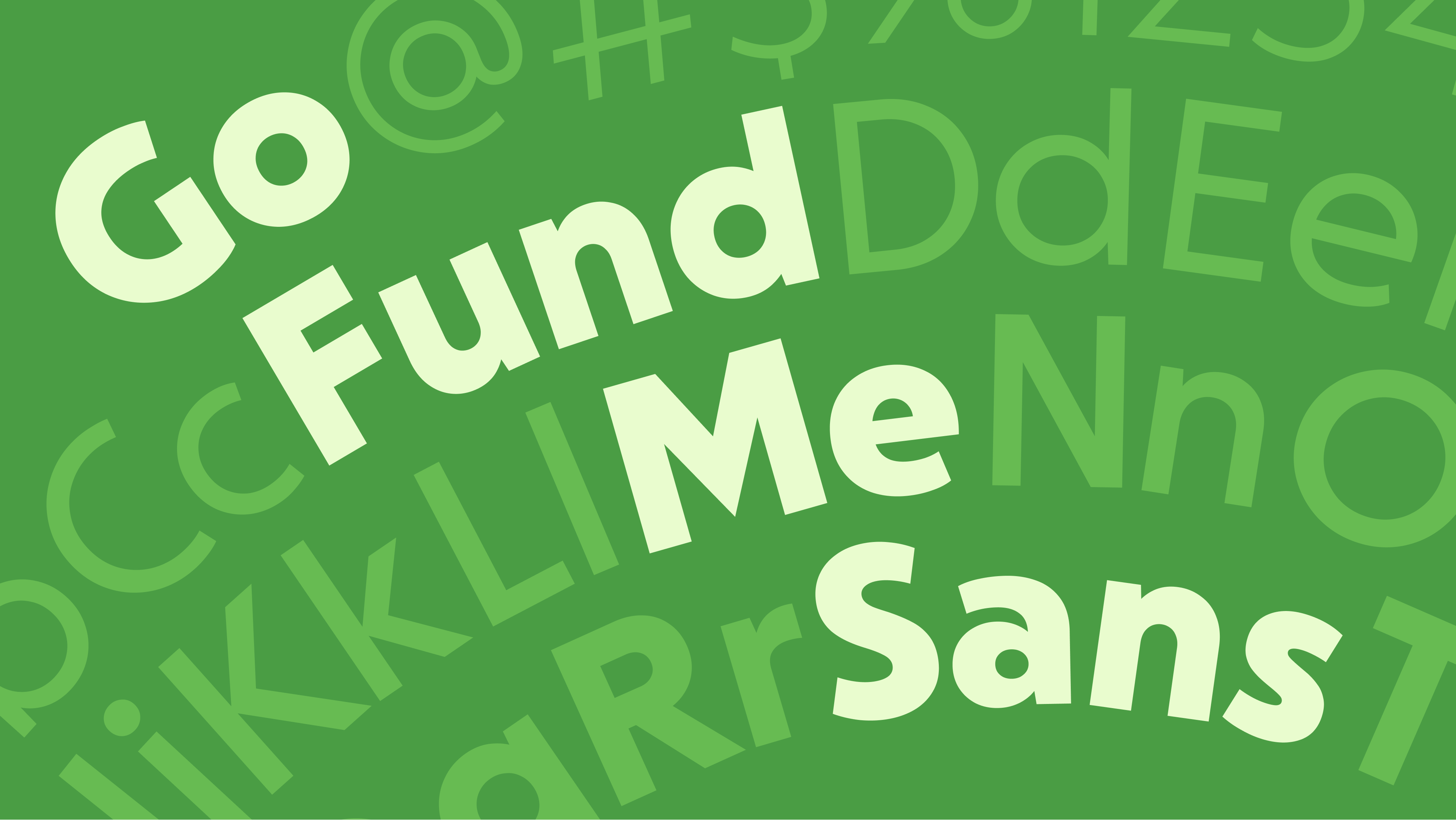
A new custom typeface, GoFundMe Sans, was designed with subtle circular forms and segments that echo the Progress Circle, bringing warmth, approachability, and clarity to every message.
Relying on a single idea to hold an entire ecosystem is one of the hardest challenges in brand design. Not only did we accomplish it, but we created a system with such flexibility and versatility that it can evolve with us well into the future. The brand tranformed from a purely functional place to a more inspiring, emotional place that makes you feel a sense of momentum and community.
Web pages that previously had no conversion are now top-converting pages.
Thoroughly covered in the press, here's how one reviewer put it:
"The real star of the show is the sun in the logo. After five iterations spread out over 16 years, it has finally gotten the care it deserves. Conceptually, it still communicates optimism, promise, and hope, but the execution is now doing some serious heavy lifting. The three rays have been reshaped with proper stroke variance and wedge-like geometry that better aligns with the typography, and more importantly, they now function as the backbone of the entire identity. Those rays transform into the Progress Circle — a unifying visual and UI device whose segments scale, satisfyingly animate, frame content, and guide users through moments of giving and progress. What was once a vaguely symbolic flourish is now a fully operational system. It’s a subtle technical adjustment with outsized impact, and a reminder that, sometimes, the smartest brand evolutions don’t scream for attention; they quietly unlock everything that comes next."