Archer wanted to redefine its role in a rapidly evolving snack landscape. As consumer demand for higher protein, better-for-you options surged, the jerky category had become a sea of sameness: dark colors, hyper-masculine visual codes, and faux rustic identities.
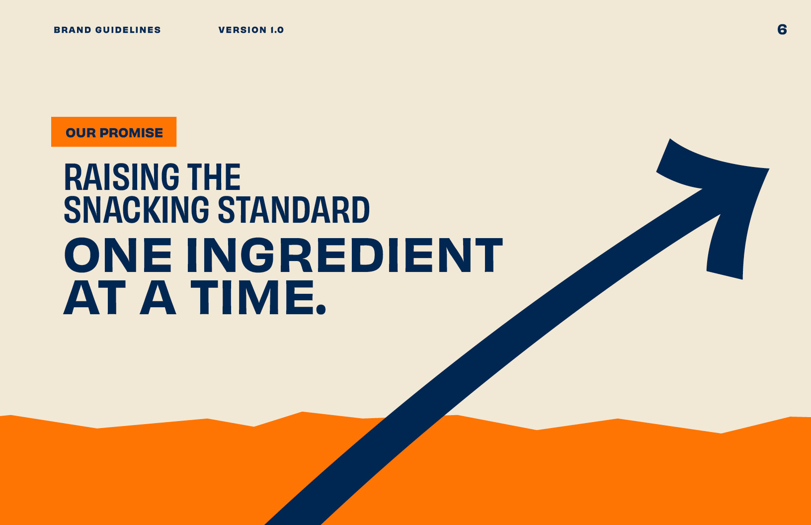
We saw an opportunity to both refresh packaging and broaden Archer’s target audience by raising the standard of snacking all together. The goal was threefold:
Rather than compete solely with meat snacks, we set our sights on the entire savory snack aisle, elevating perception, challenging outdated category ideas, and diversifying snacking occasions. Ultimately, we wanted to build a brand that felt as authentic as its ingredients: no-compromise, deliciously satisfying, and relevant to our consumers’ lives.
When did jerky get so…well, jerky? The aisle had become a parade of black packaging and macho posturing—more biker rally than better-for-you. We believed meat deserved better.
Our challenge was clear: break from category convention with a dynamic new identity that broadens awareness, cuts through the clutter, and elevates Archer as a modern, better-for-you snack.
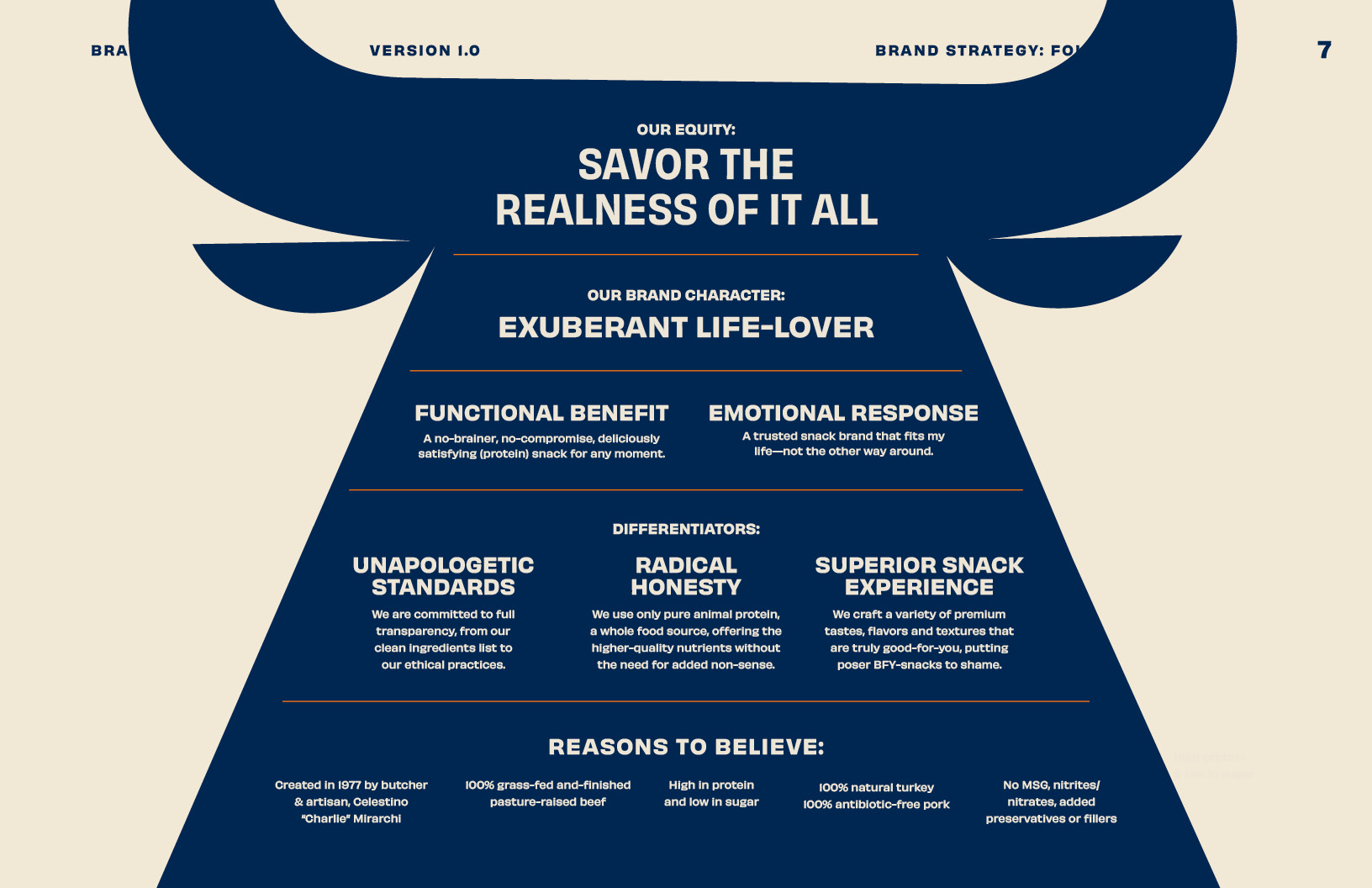
We began by grounding ourselves in Archer’s strategic foundation. The purpose, be true to food and life, and the promise, raising the standard of snacking, became our guiding principles. From there, we identified an opportunity to capture a more discerning, premium-minded consumer by elevating jerky beyond its traditional set. The competitive foil was not just meat snacks; it was the entire savory snack aisle.
Our two core audiences, “health hackers” and “gourmet foodies,” seek nutritious, quality snacks and elevated flavor profiles; however, the legacy jerky landscape did not fully meet their expectations (or their standards). To align with a more sophisticated consumer, Archer needed to clearly telegraph its core differentiators: radical honesty, unapologetic standards, bold ideas, and enthusiastic expertise. This began by treating “real” as a holistic belief system, not just a claim.
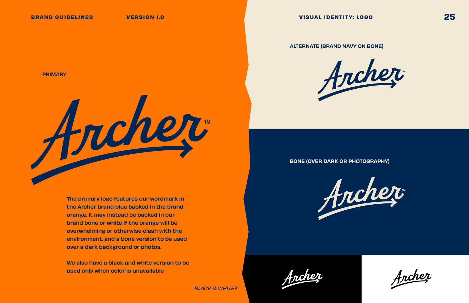
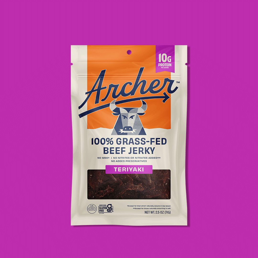
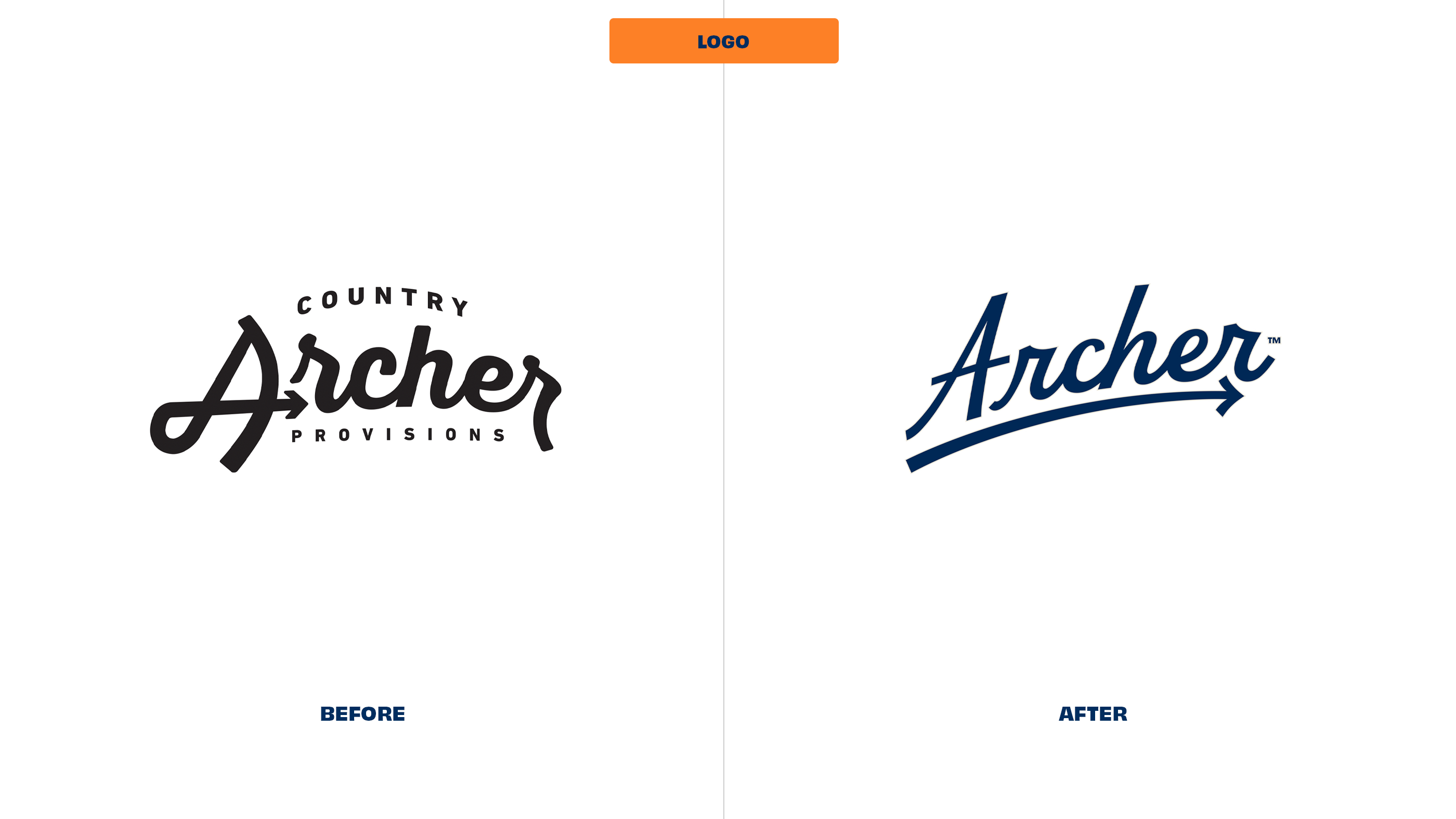
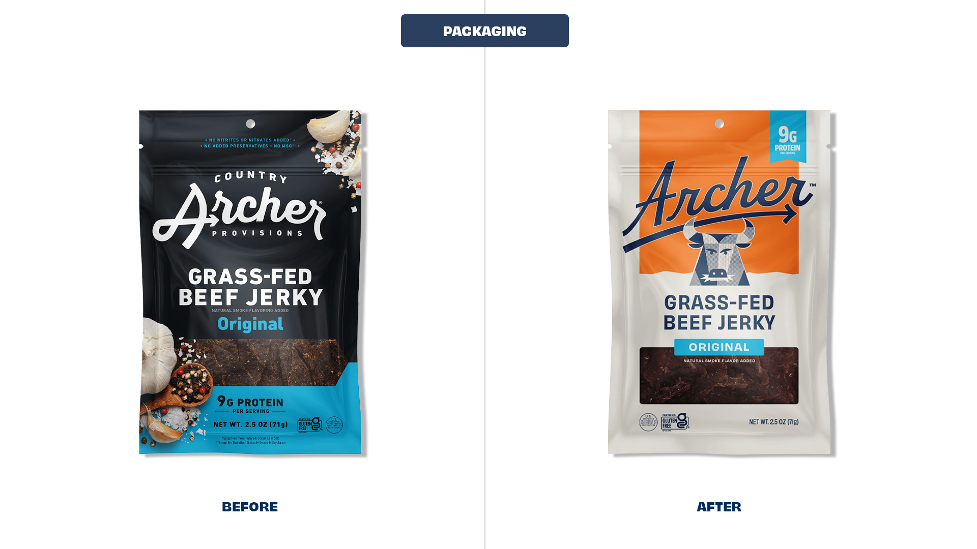
We started by addressing the brand name, Country Archer. Dropping “country” signaled a meaningful evolution that helped distance the brand from the noisy heritage jerky space as well as embrace a more premium identity. The streamlined name, Archer, feels intentional and contemporary while retaining brand equity.
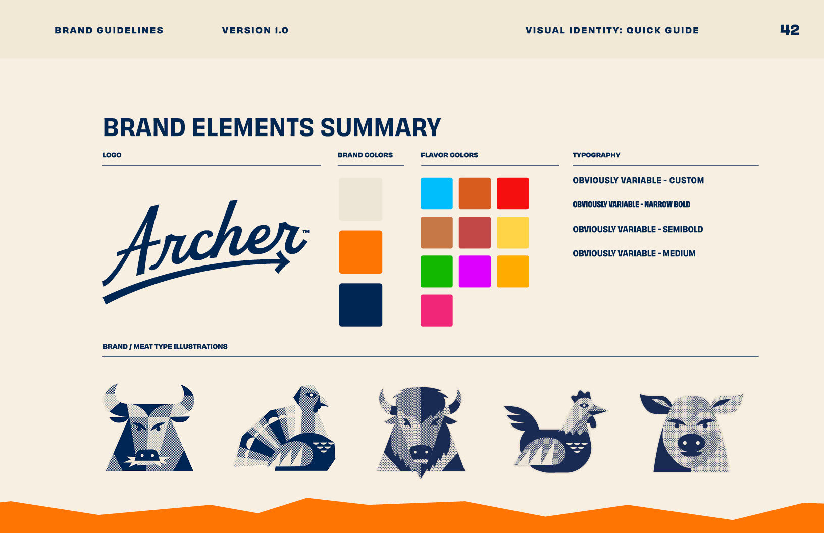
Borrowing color cues from the healthy snacking category, the redesigned packaging employs a bright, energetic palette that’s clean, bold, and arresting on shelf. Creamy beige grounds the design in approachable warmth while savory orange and deep navy deliver impact and appetite appeal. The broader palette incorporates vivid shades across the spectrum, establishing an organized, identifiable system of flavors that are easily shoppable and enticing to a premium snacker.
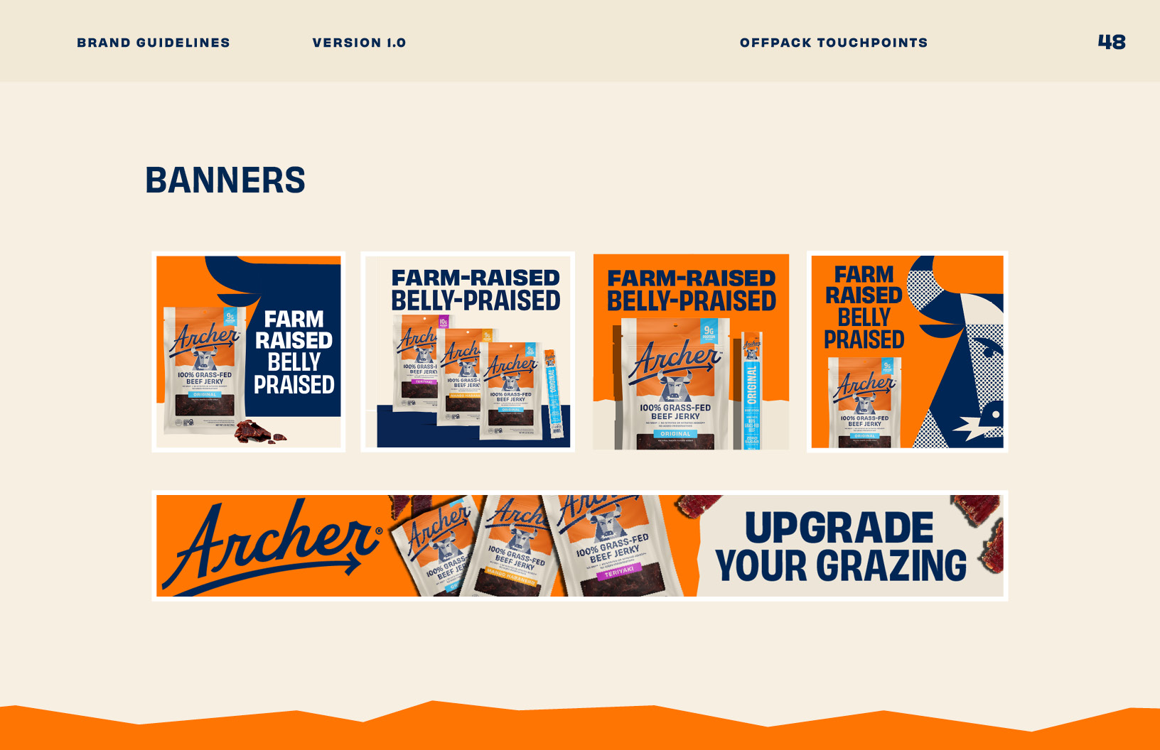
Our new design language plays with scale and thoughtful layering, adding cohesion, energy, and humanity to each layout. Never sitting in sterile isolation, elements interact to create dynamic unity.
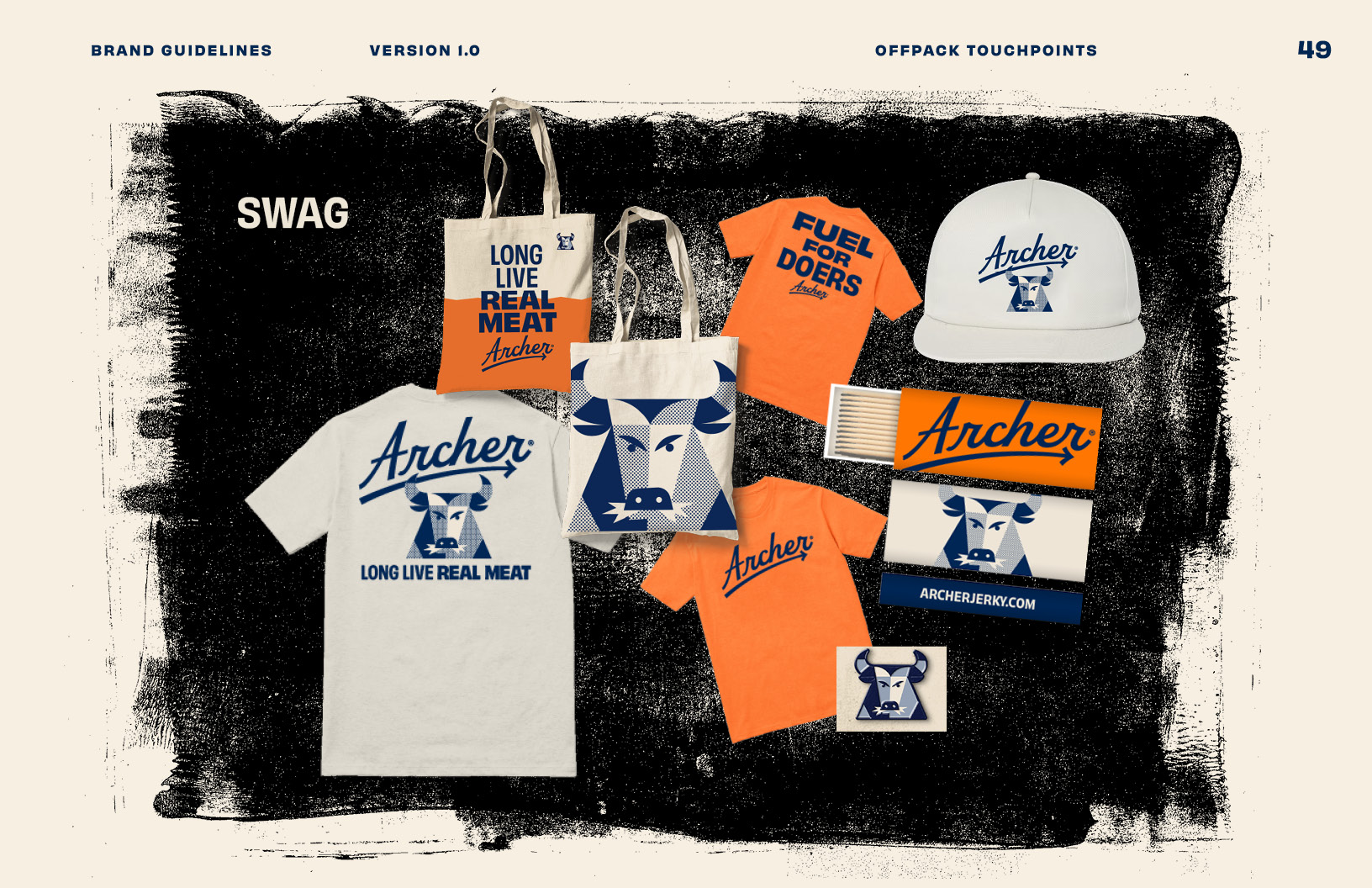
A newly introduced bull icon embodies Archer’s authentic, expressive confidence, heroizing the brand on package with unmistakable conviction. The bold graphic style reinforces Archer’s unflinching quality and expands across all SKUs, including turkey, chicken, pork, and bison. In keeping with this boldness, the new wordmark builds on Archer’s heritage, refining it with taller, forward leaning letterforms. Thick, vibrant, and dynamic, our new font’s variable widths allow adaptive flexibility while retaining legible simplicity.
The back of package reasserts Archer’s unapologetic persona with declarative authority (LONG LIVE REAL MEAT) while reinforcing transparency, clean ingredients, and protein credentials. Sharp narrative asserts Archer’s expertise with authority, highlighting craft, flavor, and broad snacking appeal.
This project culminated in packaging that balances expressive creativity with strategic clarity. It conveys Archer’s intentionality, authenticity, and craft while transforming “real” from crowded claim to confident conviction; one that cuts through category convention, differentiates at shelf, and positions Archer as a modern solution for premium, health-focused snackers. Archer doesn’t just say “real.” It stands for it—in flavor, function, and attitude.
The redesigned brand system successfully achieved our core objectives: differentiation, modernization, and stronger appeal to our target audience.
On shelf, Archer stands apart from legacy jerky competitors. The bold color blocking, ownable logo, declarative wordmark, and unapologetic messaging culminate in immediate visual impact and unmistakable brand recognition backed by a sharper, more confident position that owns its realness. The repositioning also addresses consumer desires by communicating Archer’s most salient differentiators: authenticity, quality, and craveability.
The result is a brand with a bold visual language, strong point of view, and clear identity. Our redesigned packaging is not only modern and distinctive; it’s built for long-term growth in an increasingly crowded category.