The Dream Factory has been granting dreams to Manitoba children with life-threatening illnesses since 1993, but as they prepared to open a physical space—a literal Dream Factory—they recognized the need to evolve their brand to reflect the full scope of their impact.
They weren’t just making dreams come true. They were building relationships that lasted years, supporting families through grief, recovery, and joy, and creating a place where kids could imagine possibilities beyond their diagnosis. Their brand needed to reflect that depth.
UpHouse was brought in to help craft a refreshed brand platform and visual identity that honoured The Dream Factory’s legacy while positioning them for their next chapter. The goals were threefold:
Create a brand identity that balanced warmth and whimsy with credibility and clarity
Clarify and elevate the full story of their work for donors, families and the broader community
Launch the refreshed brand with a communications plan that could build awareness and spark pride across all stakeholder groups
We set out to build something that would be embraced by the kids and families they serve, but also by the donors, corporate partners and staff who make the work possible. The new brand needed to feel like magic, but be grounded in the real, wraparound care that defines The Dream Factory’s mission.
From the beginning, we knew this rebrand wasn’t about changing who The Dream Factory was; it was about revealing who they’ve always been. That meant listening deeply. We held workshops with staff to uncover the heart of their work: the emotional moments, the behind-the-scenes support, the in-between spaces where magic lives.
One of the biggest challenges was striking a visual and tonal balance. The brand needed to feel kid-friendly without veering into “childish,” professional without becoming corporate. Our key insight was that the magic wasn’t in the dreams themselves; it was in creating a place where dreaming was possible again. A space that encouraged imagination over expectation.
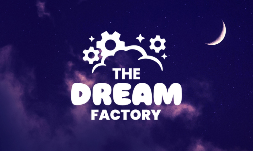
This insight shaped everything from language to design. We envisioned the new Dream Factory space as a whimsical yet grounded “dreaming factory,” where kids could receive a golden ticket, no expiration date, no limits, and be met with tangible signs of care. That metaphor guided our tone and visual identity.
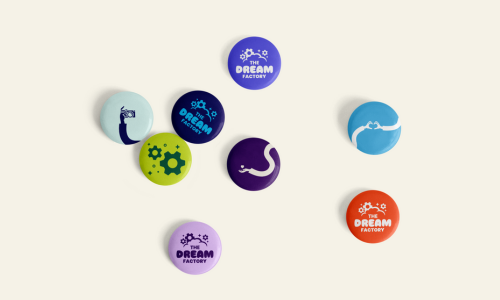
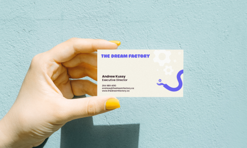
We built a visual language rooted in play and colour, with flexible elements like wavy arms that symbolized support and joy. The tone of voice was direct but comforting, acknowledging the hard parts while never losing sight of hope. And we ensured Dreamers, families, and donors were woven into the brand itself, through storytelling, imagery and co-creation.
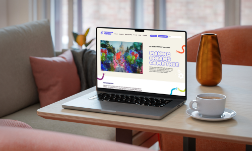
We also thought practically. Every element was designed to be usable by their small-but-mighty team. The brand kit, messaging platform, and launch strategy were built for both cohesion and creativity, giving their team tools to communicate with consistency across all touchpoints.
The brand launched in conjunction with the opening of their new physical space, creating a natural moment of celebration and visibility. Internally, the new identity sparked excitement: staff embraced the brand and found joy in using it; student placements dove into content creation with newfound confidence and clear guidelines.
Throughout the process, we stayed grounded in the emotional weight of the work. This wasn’t just about a visual update. It was about holding space for hard things—grief, illness, uncertainty—and still offering hope. That’s the unique power of The Dream Factory, and we made sure the brand made room for it all.
The success of this rebrand wasn’t just in the launch, but in how the brand was embraced. Staff immediately began using the new brand kit with confidence, creating content that felt aligned, expressive and joyful. Internally, the work deepened alignment on purpose and messaging, with team members feeling more connected to what The Dream Factory stands for and how to communicate it.
Externally, the reception was just as warm. Families were drawn to the playful elements, like the vibrant colours and signature wavy arms, while still recognizing the thoughtful, wraparound support they represent. Donors and community members echoed that the new identity felt like “a perfect blend of wonder, community and hard work.”
The tools we delivered weren’t just used—they were loved. From student interns to senior team members, everyone felt equipped to create and share content that reflected The Dream Factory’s magic in an authentic, clear way.
Most importantly, the brand reintroduced the full story of their impact. It gave language to the moments that happen outside of dream-granting, where deep care and connection live. And that, ultimately, was the goal: to build a brand that felt like a true reflection of who they are, and who they’re becoming.