The ACLU operates as a nationwide movement made up of more than 50 affiliates, departments, and campaign teams. While the organization’s voice and impact are powerful, its scale creates a constant challenge: how to maintain a clear, unified brand across thousands of materials produced by many different teams.
The objective of this project was to build a brand identity system that could scale with the organization. The system needed to maintain the strength and recognizability of the ACLU brand while giving internal teams practical tools to create their own materials quickly and confidently.
Studio Mosaic partnered with the ACLU to translate the brand vision into a usable system. Our goal was not simply to design assets, but to create a framework that allowed the brand to be applied consistently across campaigns, communications, and advocacy work happening simultaneously across the country.
Studio Mosaic helped carry this vision into reality by designing and implementing a comprehensive brand system built for real-world use.
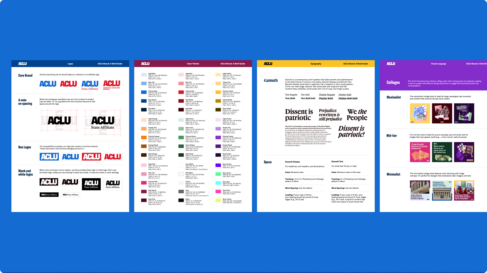
Our team developed a flexible framework of templates, guidance, and assets that could be adopted by more than 50 teams across the organization. The system was designed to support thousands of pieces of collateral while maintaining a consistent visual identity.
Rather than focusing only on aesthetics, we focused equally on usability and adoption. Every element of the system was structured to help teams quickly produce materials while staying aligned with the brand.
Key components included:
• A scalable visual identity framework adaptable across campaign types
• Modular design templates for common communications needs
• Clear brand usage guidance and documentation
• Asset libraries and structured file systems for easy access
• Implementation support to ensure adoption across teams
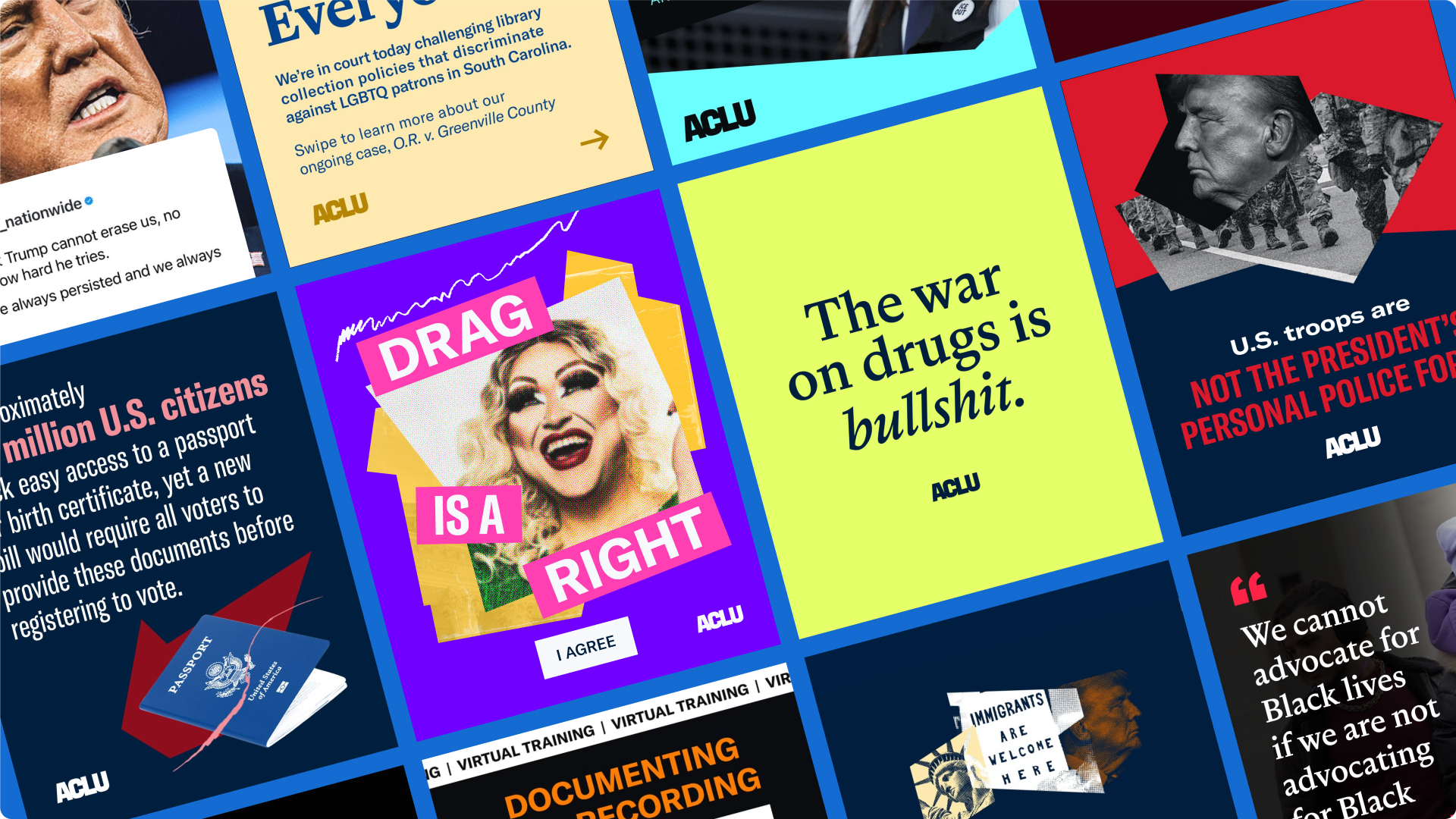
This approach paired strong design with thoughtful operational structure, allowing the ACLU brand to remain cohesive even as dozens of teams created materials simultaneously.
The brand system enabled the ACLU to scale its communications while maintaining consistency across a complex national organization.
The work supported:
• Thousands of pieces of collateral created across the organization
• Adoption by more than 50 internal teams and affiliates
• Faster production of campaign and advocacy materials
• Greater visual consistency across communications
By pairing thoughtful design with practical systems and project management, the brand identity became something teams could actively use, not just reference.
The result was a brand that could move at the speed of the organization’s work while remaining cohesive, recognizable, and powerful.