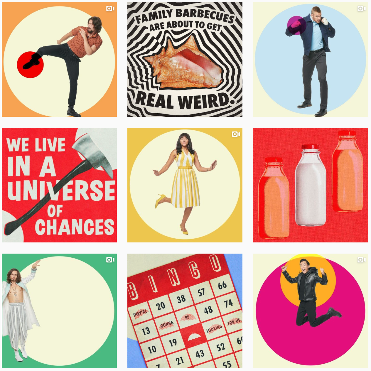
In season two of The Umbrella Academy, our super siblings traveled back in time to the 1960s…and brought our campaign with them. Our goal was to solidify and strengthen the fandom we created in Season 1 by feeding them content for their faves, taking on a fresh look, and making every single fan feel like a Certified Brelly.
Before our campaign began, our account had 1.3M followers and a loud fandom dying for news around S2. Knowing that the secrets we held about Season 2 were huge visual drivers, we designed a strategy that focused on unveiling the 60s time travel theme slowly but surely. We built a massively groovy grid in pre-launch culminating in key reveals of characters and setting. We built curiosity about each character and strategized teasing certain pairings and plot points. We built a fan club on our Close Friends IG Stories to tease exclusives. Come launch, we experimented with custom A/V, endless memes, BTS, and fan favorite moments. We released a custom IG filter that put our Brellies in the shoes of their absolute faves. As well as a slew of custom collectible art that stylistically memorialized our characters well after the official poster dropped. We wanted the grid to feel like you were time-traveling and getting in trouble with the Hargreeves day in and day out.
We started with a base of 1.3M followers after our S1 campaign and grew to 3.2M by the time we were finished on S2 — 1.9M new followers and a 146% increase. This budding fandom grew into an army — thanks to our buzzy and prolonged tease approach and endless feeding of fans with custom content and art that went beyond the basics. Posts that we designed just to feed our fandom turned into unique press headlines — everyone was watching for a new easter egg or poster collectible. Everything in our grid was designed for a fan to DM, share to stories, and set as their wallpaper. Our tireless visual exploration of the TUA world as well as unique interactive opportunities kept our fandom growing into a super following.
