Nearly half of U.S. adults have high blood pressure, yet about three in four adults with hypertension do not have it under control. For the CDC Foundation, the challenge wasn’t simply raising awareness of hypertension, it was making an invisible, often symptomless threat impossible to shrug off, especially among busy adults ages 35–54 who already knew they had high blood pressure but had not prioritized getting it under control.
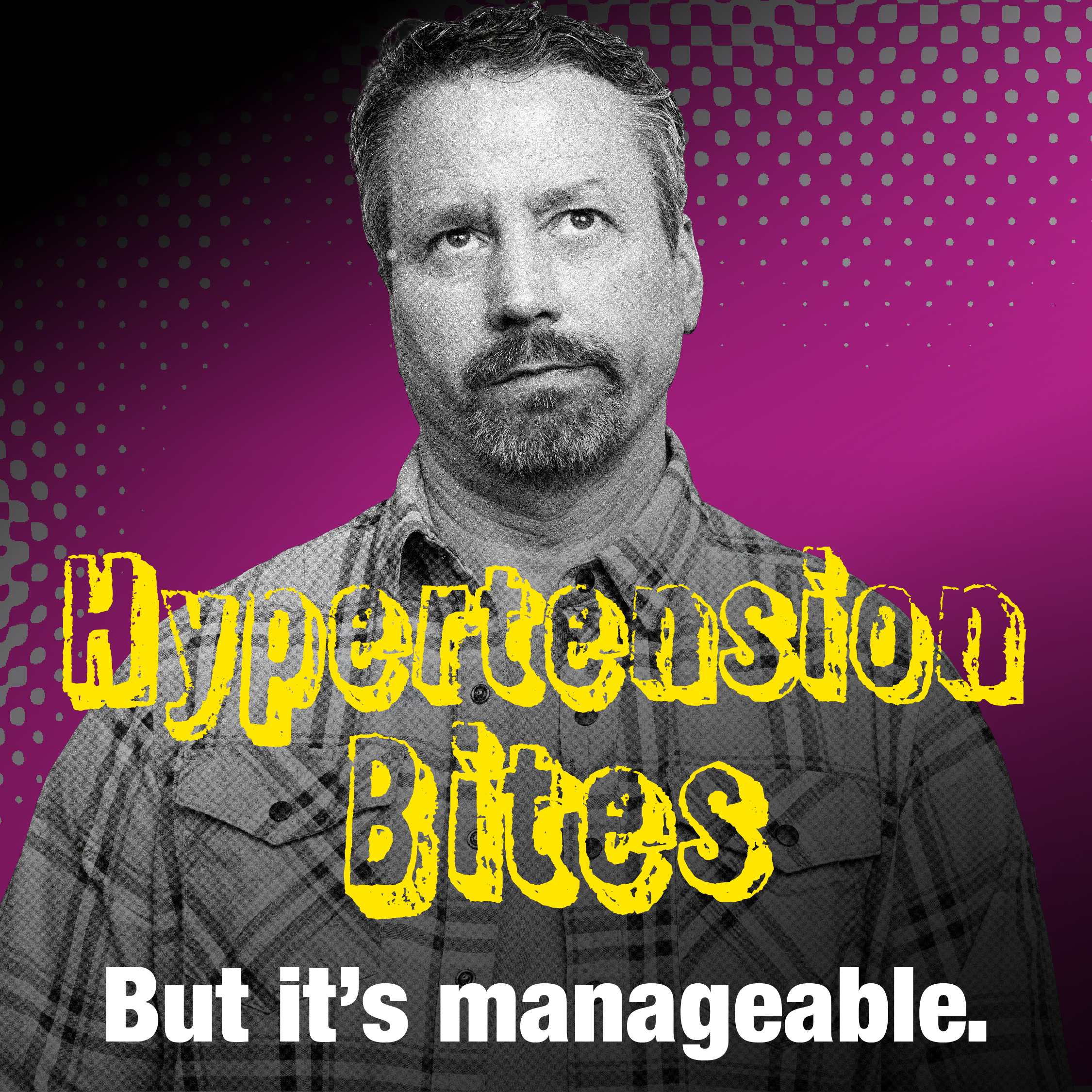
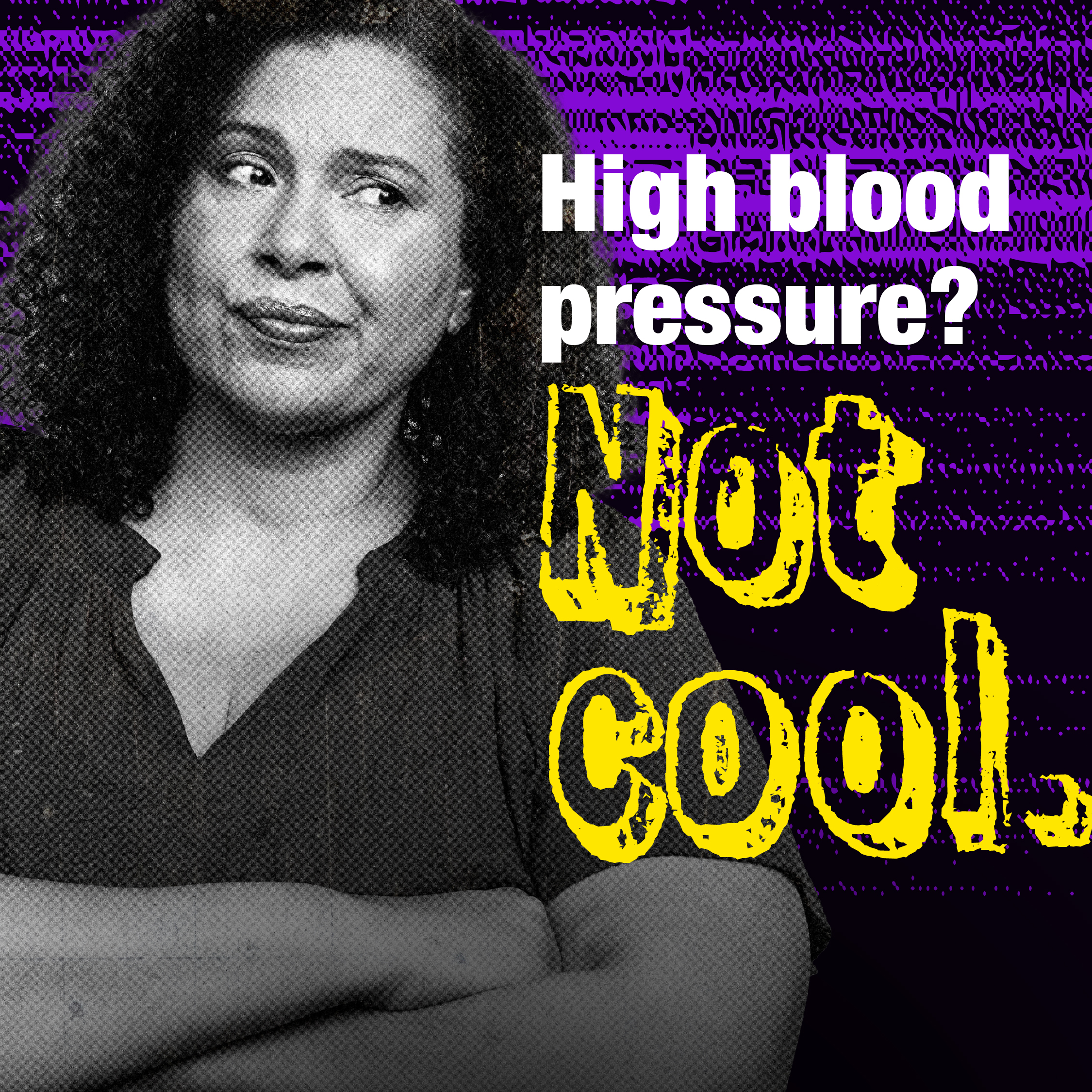
Hypertension Bites turned a defining Gen X attitude into a visual wake-up call. This is a generation that perfected the shrug, the eye roll and the “whatever” - -resilience that helps them handle careers, caregiving and everyday stress, but can become dangerous when applied to a condition quietly damaging the body. Instead of traditional clinical health imagery, we built an image system inspired by the bold visual culture of the 1990s: vivid colors, collage-style compositions, expressive typography, textured graphics and relatable portraits that made hypertension communications feel more like culture than medicine.
The goal was to use arresting, culturally familiar imagery to stop the scroll, create urgency without shame or fear, and turn attention into empowerment. Every image ultimately reinforced a simple behavior-change message: Hypertension is serious, but control is possible. Know your numbers, work with a health care professional and make a personalized plan to get—and stay—below 130/80.
Hypertension is called a “silent killer” for a reason: people can feel fine while uncontrolled blood pressure damages their heart, brain, kidneys and blood vessels. That invisibility created a creative problem. How do you make people see—and care about—a threat they cannot see or feel?
We started with the audience rather than healthcare conventions. Research identified adults ages 35–54 with diagnosed but uncontrolled hypertension as the priority audience and explored their lived experiences, barriers, knowledge gaps and communication preferences. The creative platform translated those insights into a culturally fluent visual language built around a familiar behavior: shrugging things off.
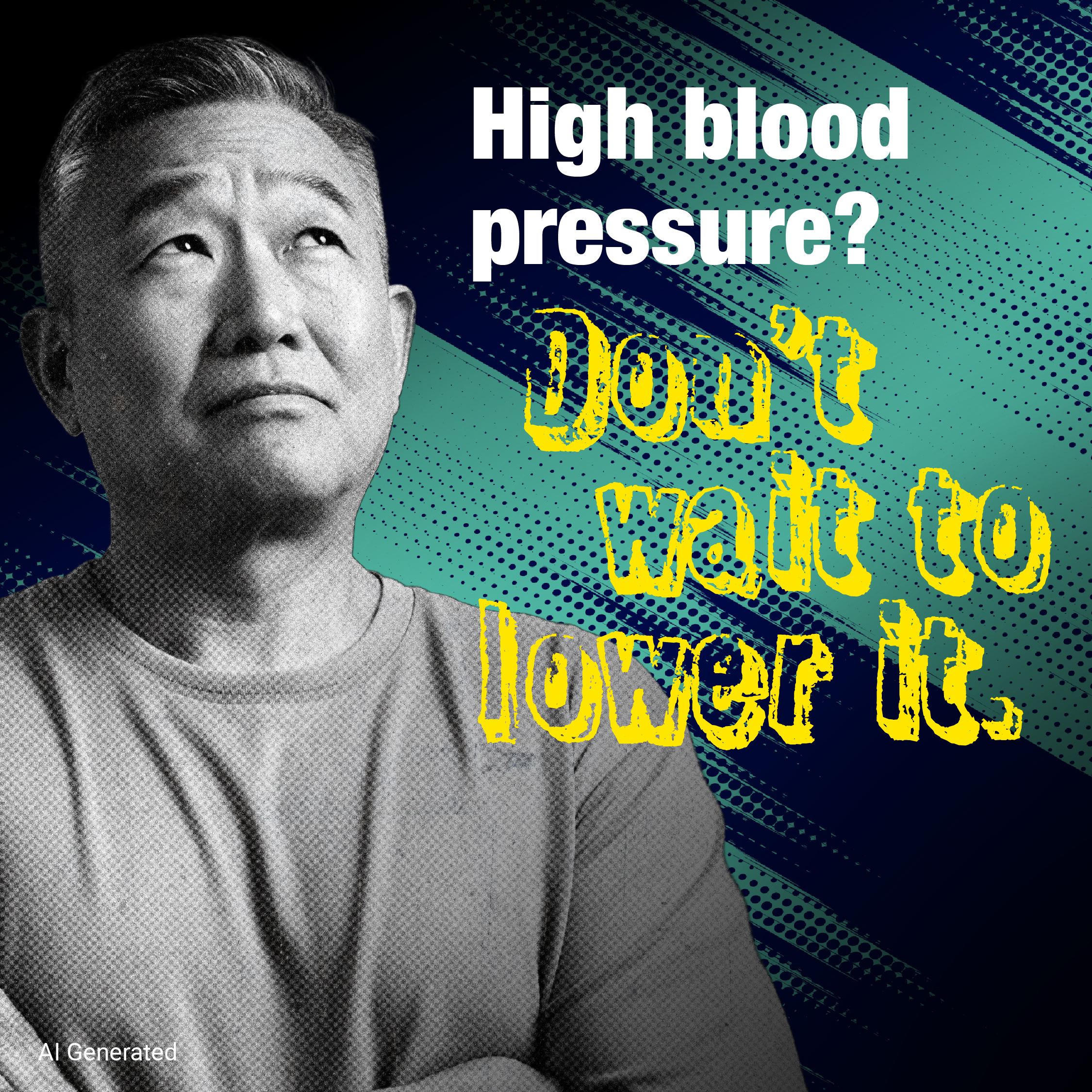
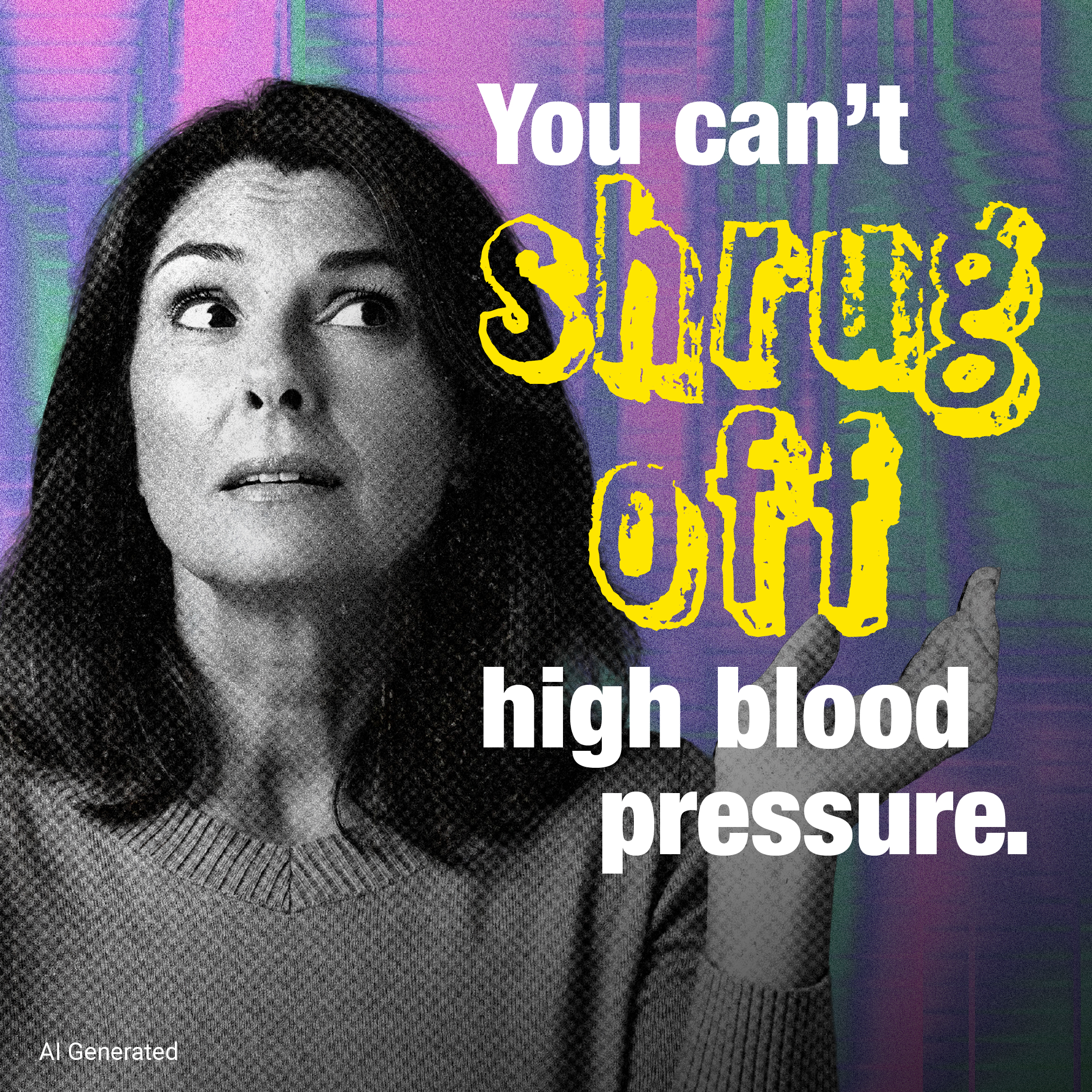
The result deliberately rejected the visual codes of traditional health advertising. Drawing from 1990s MTV, magazine collage, pop-art graphics and the cultural familiarity of Reality Bites, Hypertension Bites combined black-and-white portraiture with electric color, layered textures, hand-crafted graphic treatments and oversized, expressive typography. Portraits showed real, recognizable midlife adults—not idealized “patients”—while copy such as “You can’t shrug off high blood pressure” turned an everyday gesture into a memorable visual metaphor.
Importantly, those choices weren’t based on instinct alone. Quantitative testing with 386 adults with diagnosed but uncontrolled hypertension evaluated campaign imagery, hero portraits and social assets. Body language proved especially important: 47% selected relatability of facial expressions or gestures as a reason for preferring hero portraits. Social image concepts scored strongly for both attention and appeal, with the “You can’t shrug off your high blood pressure” version emerging as the preferred execution.
That research-informed image system was then adapted across social static ads and carousels, programmatic display, USA TODAY promotional units, the campaign website and creator content—allowing one visual idea to remain recognizable across very different environments. The manifesto execution extended the aesthetic through animated cutouts, moving textures, supers and graphic devices that transformed “shrug,” “eye roll” and “whatever” into visual storytelling.
The team continued optimizing after launch. USA TODAY found that promotional creative pairing lifestyle imagery with direct-question copy performed strongest, while campaign reporting found static display outperformed animated assets in programmatic placements. On Reddit, however, a visually distinctive static execution featuring AI-generated imagery became the platform’s top-performing creative—demonstrating the value of adapting the visual language to audience behavior rather than applying one format everywhere.
The images didn’t just attract attention, they helped make hypertension relevant, memorable and actionable.
Before launch, the creative proved its ability to break through: 78–81% of research participants rated the tested social image assets attention-grabbing, while the “You can’t shrug off your high blood pressure” execution was the audience favorite.
In market, the visual platform delivered at scale. The USA TODAY partnership generated 8.7M+ impressions, exceeding its 7.8M goal, while social amplification delivered 1.1M impressions. Facebook generated 52,867 engagements and a 7.96% engagement rate versus a 2.62% benchmark. The interactive experience drew 99,265 page views—nearly three times benchmark—and 50,090 unique visitors.
More importantly, exposure translated into measurable campaign impact. A Nielsen study found statistically significant lifts in Hypertension Bites familiarity (+9 percentage points), affinity (+15 points) and recommendation intent (+15 points); 55% of exposed respondents recalled the initiative when prompted. The content earned an 88% favorable overall rating, while 80% said they intended to share it and 66% rated it highly for uniqueness—well above Nielsen norms.
Across the broader paid campaign, the visual system continued to reveal what moved audiences: short-form video led Meta performance, while static imagery outperformed animation in programmatic display and a distinctive static execution was Reddit’s top-performing creative.
For a health issue defined by invisibility, success meant making hypertension visible enough to stop and notice, relevant enough to remember and actionable enough to do something about.