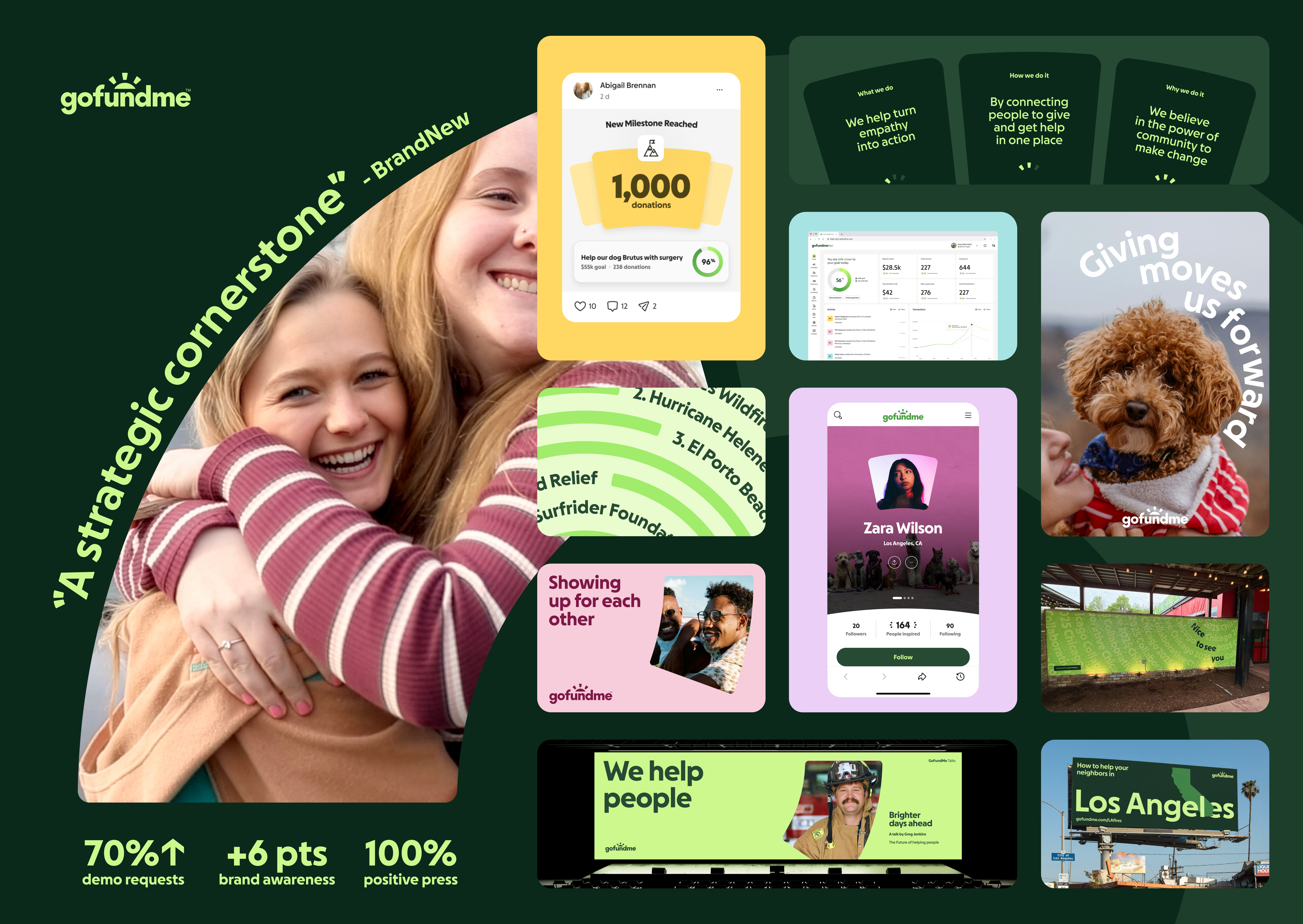
This GoFundMe rebrand had 3 goals:
1. Develop a more authoritative, bold, and vibrant brand voice and style that turns GoFundMe into a destination and strengthens the sense of shared community around giving and getting help.
2. Unify individual and nonprofit support under one identity so more people find the right help, faster.
3. Remove barriers of an inaccessible design, and use behavior-driven design to move more dollars to the causes that need it.
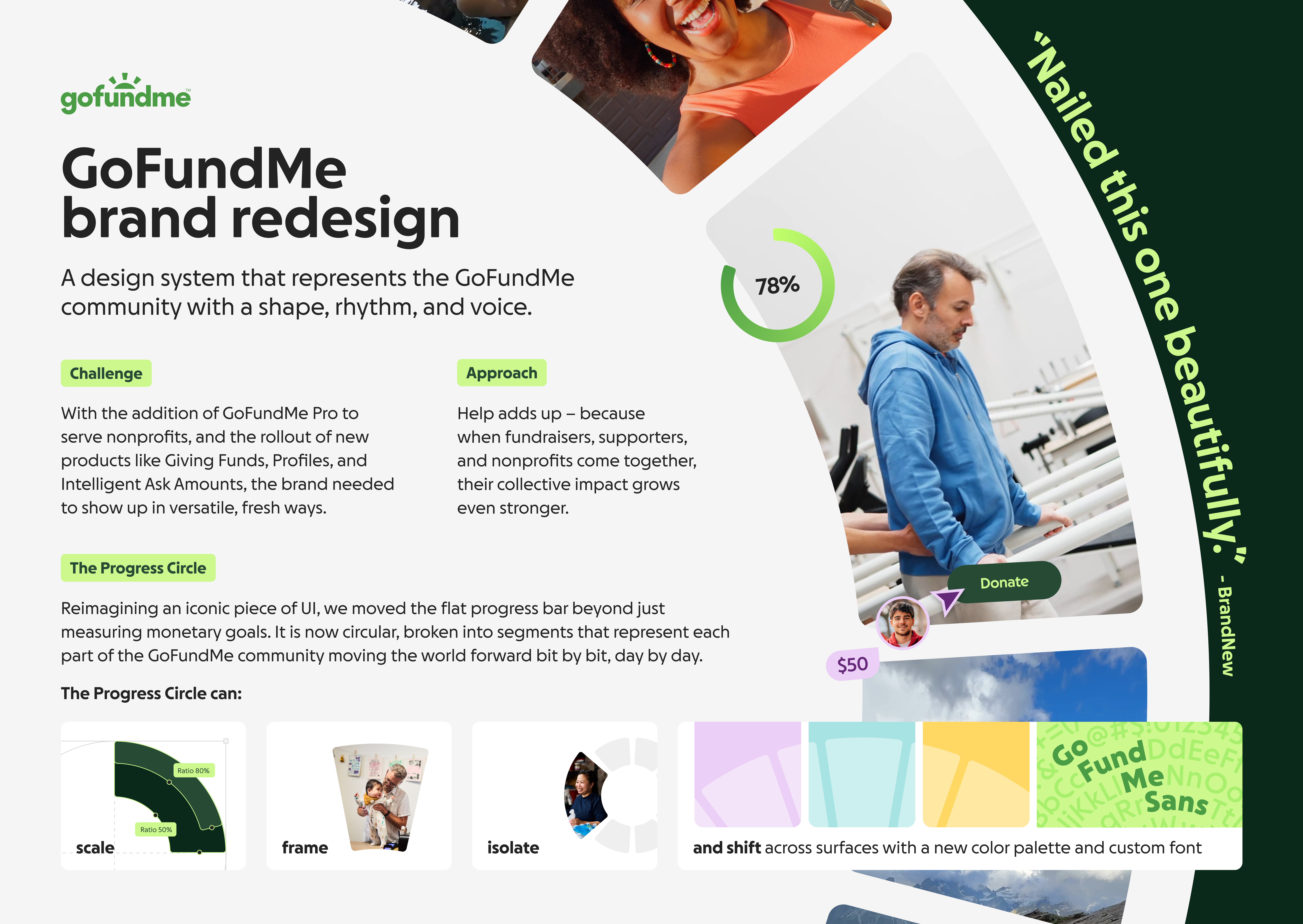
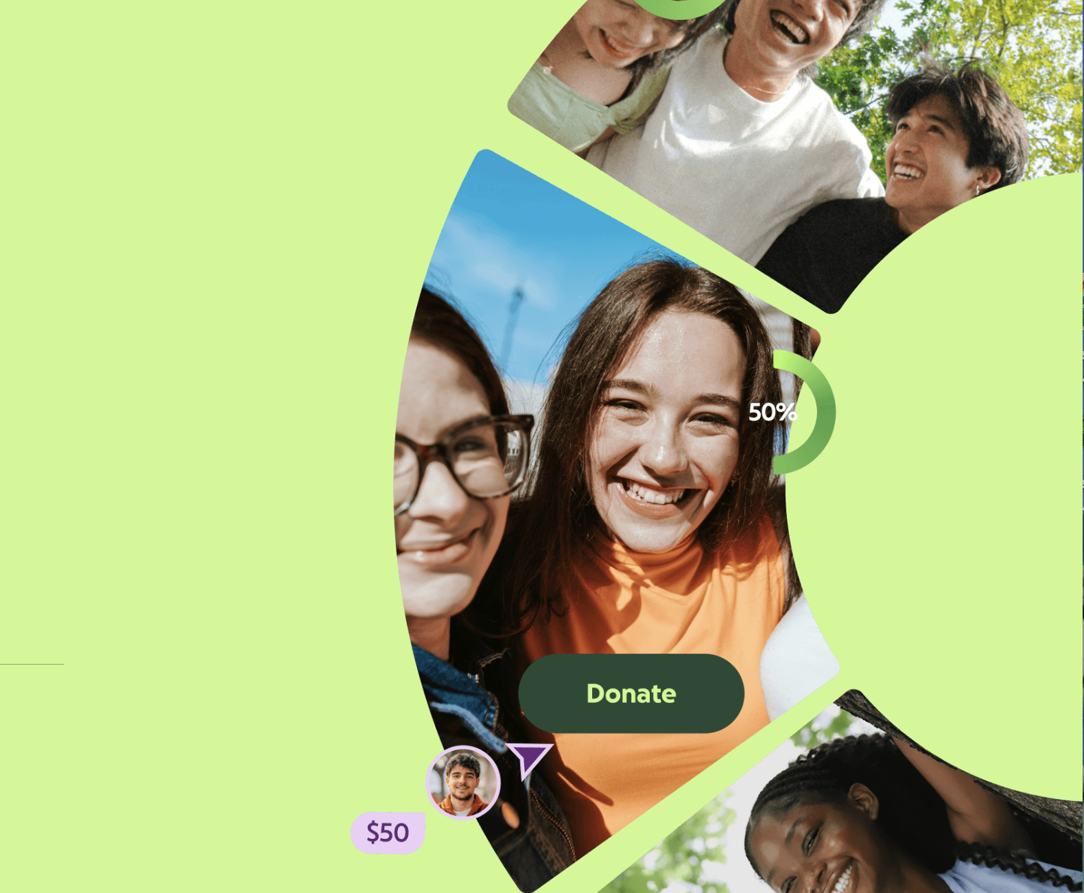
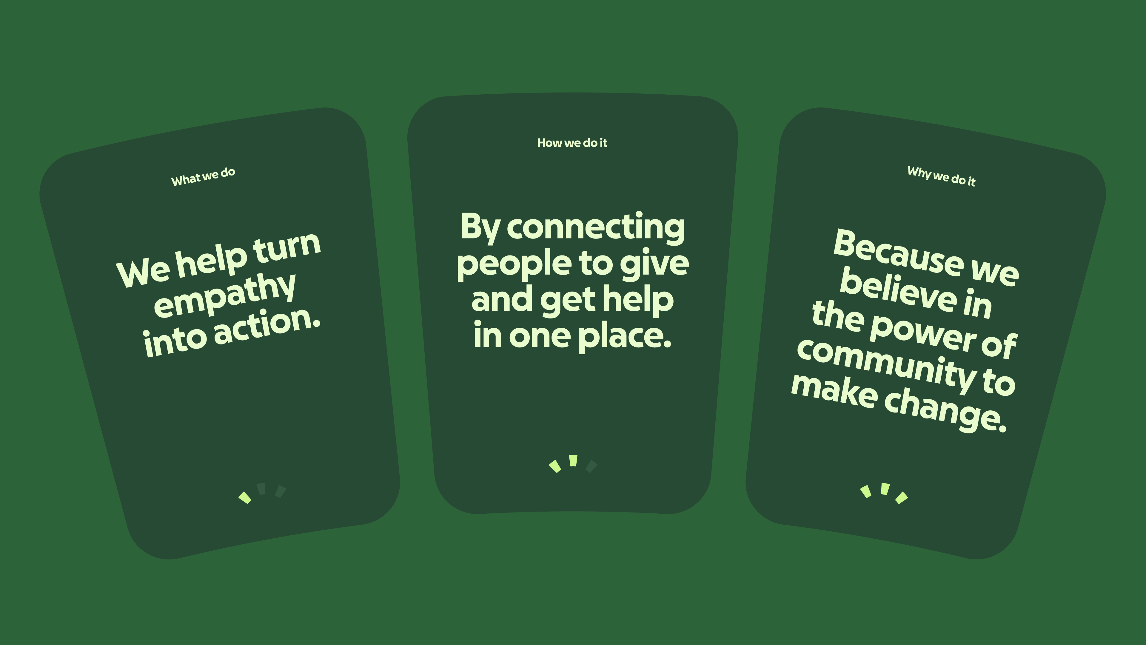
GoFundMe replaced its flat progress bar with the Progress Circle — a data-driven design shift that increases dollars raised — as the anchor of a full rebrand. Each segment of the progress circle represents fundraisers, supporters, and nonprofits coming together to make the world better.
The re-imagined brand features new vibrant color, a custom typeface, stronger voice and identity, and a conceptual design system built on humanity, community, and optimism. Why? To drive more dollars towards the causes that need them most.
By evolving an inaccessible, flat design system into a bolder identity, we laid the building blocks for creating a stronger community around giving and getting help.
Increased brand engagement and financial support to worthy humanitarian causes.
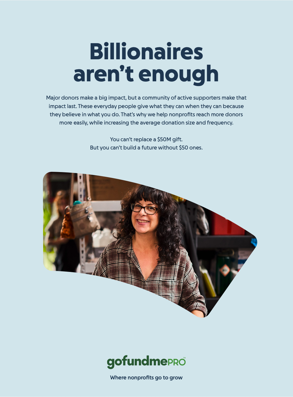
- 70% increase in requests for a demo after the new design was applied to the GoFundMe Pro product page
- +6 point lift in brand awareness following the redesign
- 100% positive press