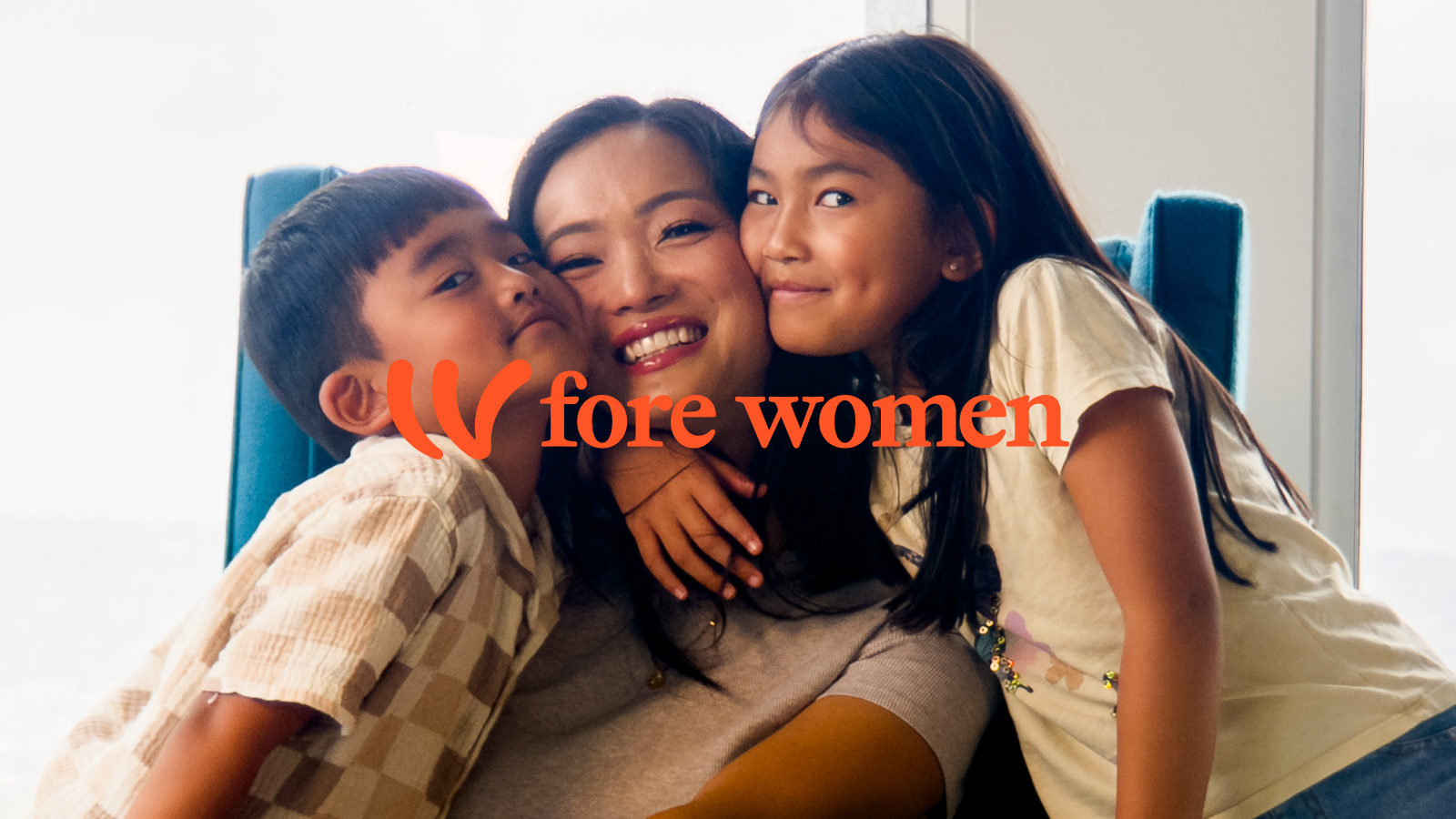
In 1909, a group of 16 women came together, determined to address the needs of women in Los Angeles. With their shared Jewish values and a vision for change, these women created a model that still inspires us today:
Help women, and you help the whole community.
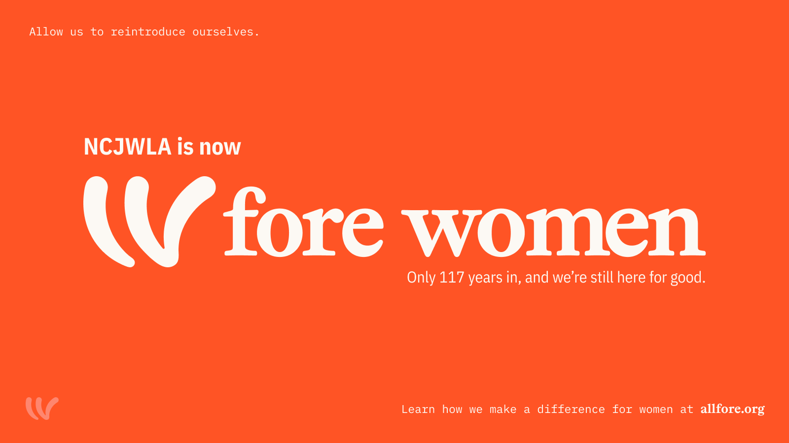
The group launched the LA chapter of the National Council of Jewish Women (known as NCJW-LA. In 2026, they faced changes in the national organization, which created an immediate need to rename the organization and launch a new brand while assuring the community they had served for over a century that they were here to stay.
With only 90 days to change their name, NCJW-LA would set out to rebrand their now complex organization, which included "The Council Shop, a chain of resale shops that fund the work and serve as the public's widest exposure to the brand.
The Obstacles: The organization had become complicated; program naming was rife with long titles, seemingly disconnected strategies, and brand identities that didn't connect and at times conflicted with each other. Understandably, few understood the work. Even program participants often didn't connect one program to another.
The brand objective: Be as simple as possible. Connect people to our work at all points of contact.
Our Strategy of Voice
Name:
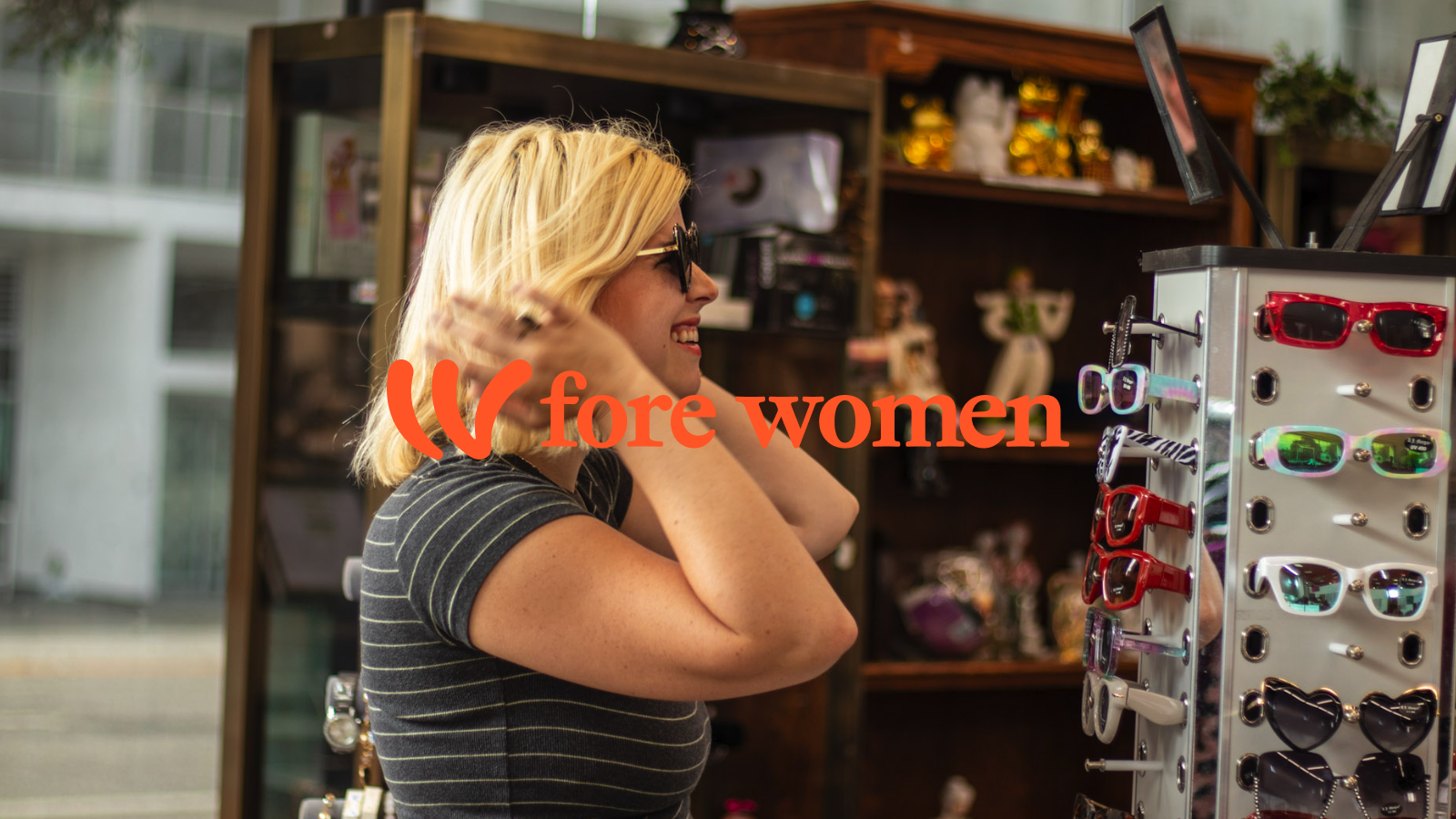
Fore Women
The name we selected is exceptionally clear, yet it also serves as a vehicle for inspiration and hidden meaning when needed. Fore refers to that which is ahead; it subtly recognizes the tradition of "the four matriarchs of Judaism," and it reminds you why our organization exists.
Brand System:
Launch Campaign:
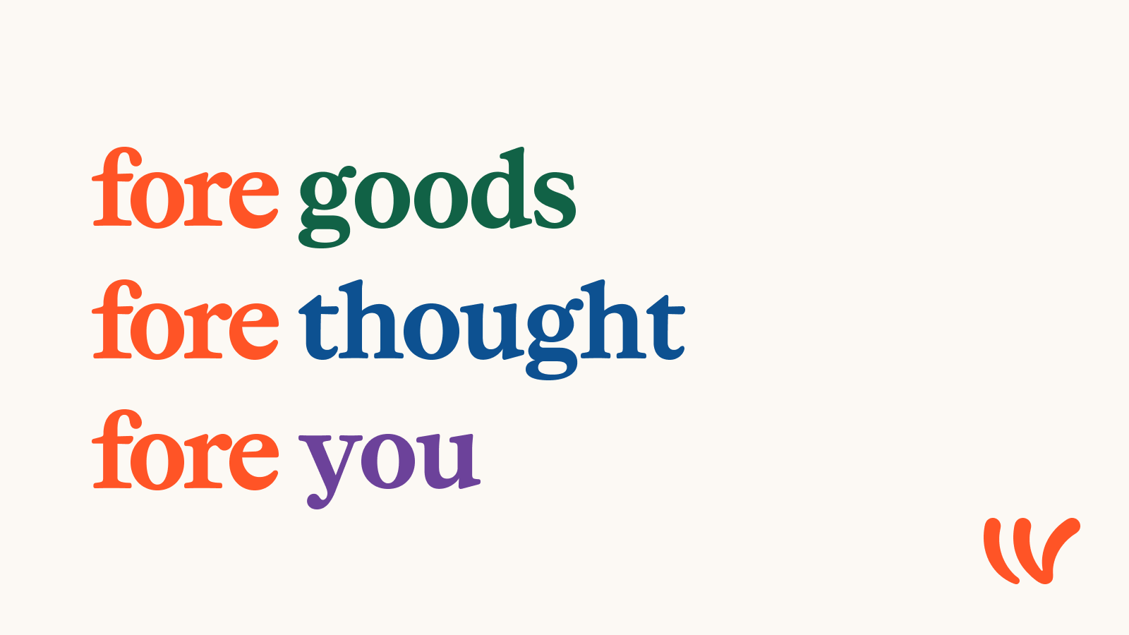
Here For Good.
As part of our launch, we want to remind people that we have been here for a long time, and we are here to stay. Our message highlights that we are here for a purpose. To do good. This message recalls our 100+ year history and rootedness, while indicating our permanence. Simultaneously, it makes a claim about our purpose. When paired with the name, it reminds us what that purpose is. Rather than a niche focus, it is our big strategy.
The Mark:
The core logo is a simple wordmark which applies across subbrands consistently. The master brand is paired with an illustration that is both abstract and specific. In one glance, it looks like a "W," perhaps for "Women"; in another, it looks like "IV," the Roman numeral four. Serendipitously, it also resembles a Shin, which refers to transformation.
The Brand Campaign:
We launched the brand with a complete identity system and brand campaign that includes a series of creative elements:
Fore Women serves an LA audience, but has become influential across the state for its advocacy work and across the country in the community of Jewish organizations, including the network from which they have separated, NCJW. According to one chapter, in a First Look reveal event, "You've always been a leader among us. Through this change, you continue to be a leader to us."
We are still collecting numeric results after our August six launch, but we've seen the following anecdotal outcomes:
We're thankful for the early results, and early signs tell us people are understanding our mission, what we do and why they should support what we do.