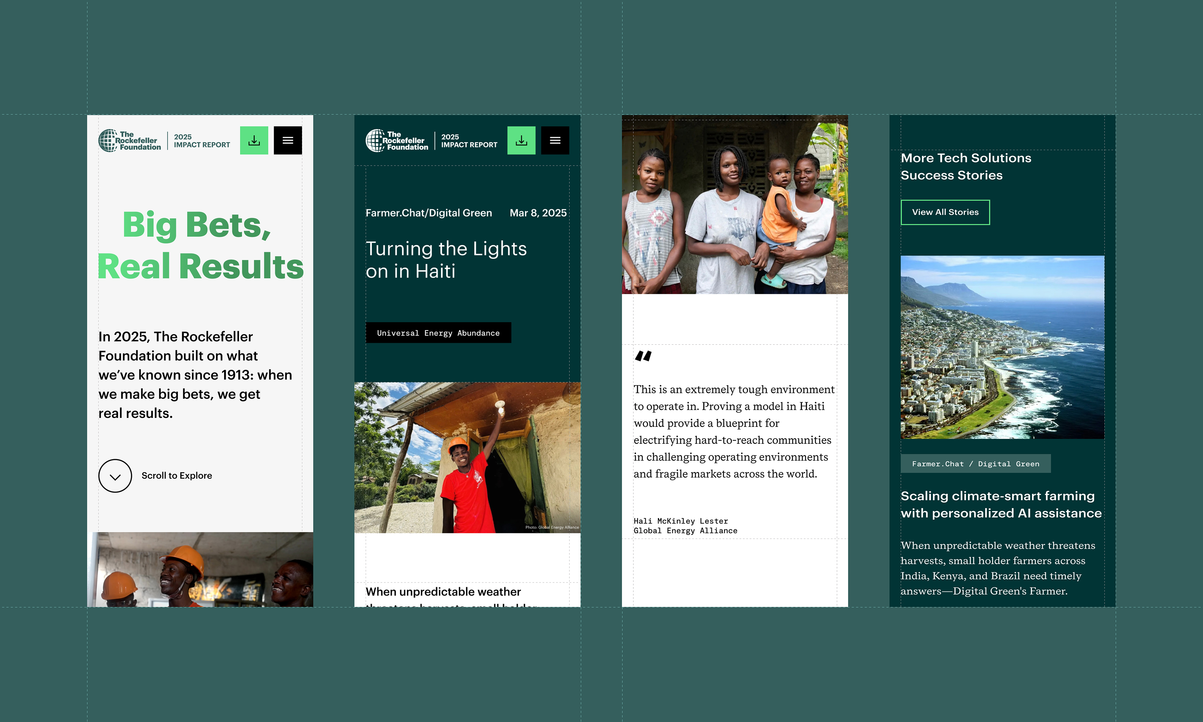
The Rockefeller Foundation has been making big bets for more than 113 years, but its 2025 Impact Report needed to do more than document a year of work. It needed to help people understand the scale, urgency, and human impact of that work in a faster, clearer, and more engaging way.
As the Foundation’s first interactive digital impact report, the objective was to move beyond a traditional annual report format and create an experience designed around the needs of distinct audiences: partners, policymakers, funders, grantees, media, and internal stakeholders. The report had to make complex work across food, energy, health, jobs, climate, technology, data, and systems change easier to navigate, understand, and share.
The goal was to use the digital format strategically. We wanted to combine editorial storytelling, video, motion, illustration, data visualization, and clear user pathways to show not only what The Rockefeller Foundation funded, but how its approach works: using frontier technology, community-driven models, and decisive data to deliver measurable change.
Success meant creating a report that felt credible and rigorous, but also human and accessible. It had to reflect The Rockefeller Foundation’s role as an innovative leader in global philanthropy while giving users an intuitive way to explore the stories, numbers, and lessons behind its impact.
The strategy centered on turning a complex institutional report into a guided digital experience. The Rockefeller Foundation’s work spans many geographies, issue areas, partners, and forms of impact, so the first challenge was structure: how to help users move through a large amount of content without losing the larger story.
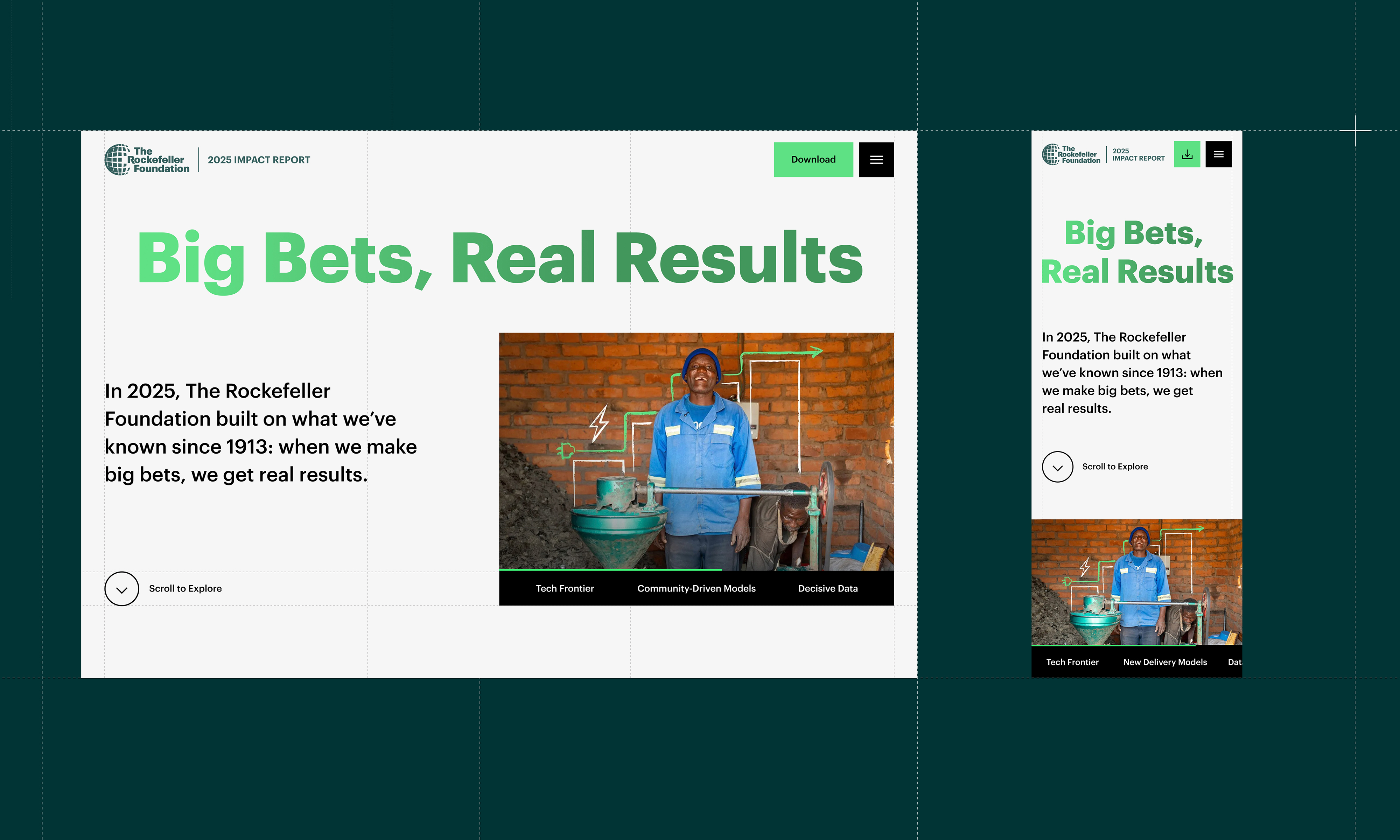
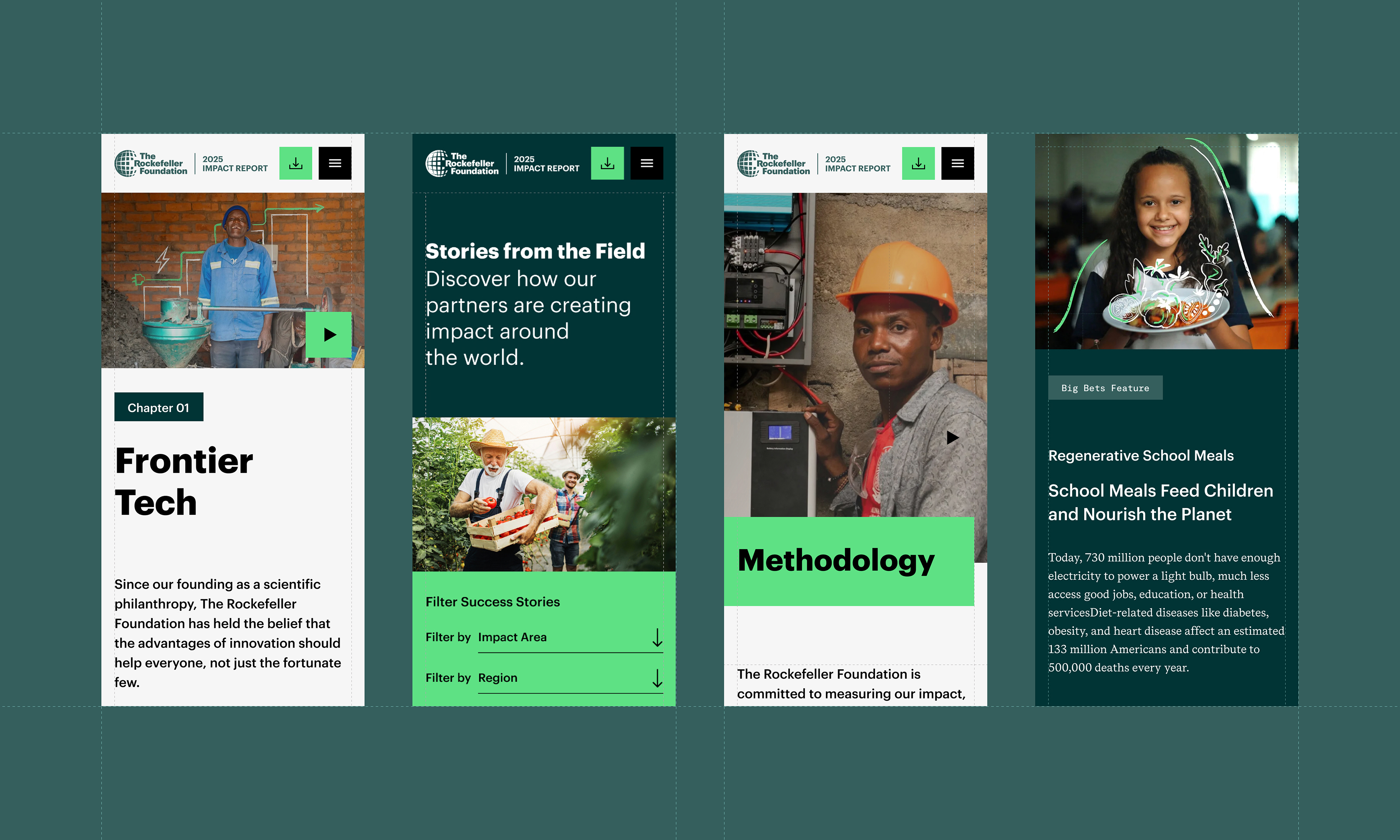
We built the experience around the report’s core narrative, “Big Bets, Real Results.” That idea became both the organizing principle and the user journey. Rather than asking audiences to read a linear report from beginning to end, the site invites them to explore through three strategic chapters: Frontier Tech, Community-Driven Models, and Decisive Data. Each chapter shows a different way the Foundation leverages innovation, local knowledge, partnerships, and evidence to help solve systemic challenges.
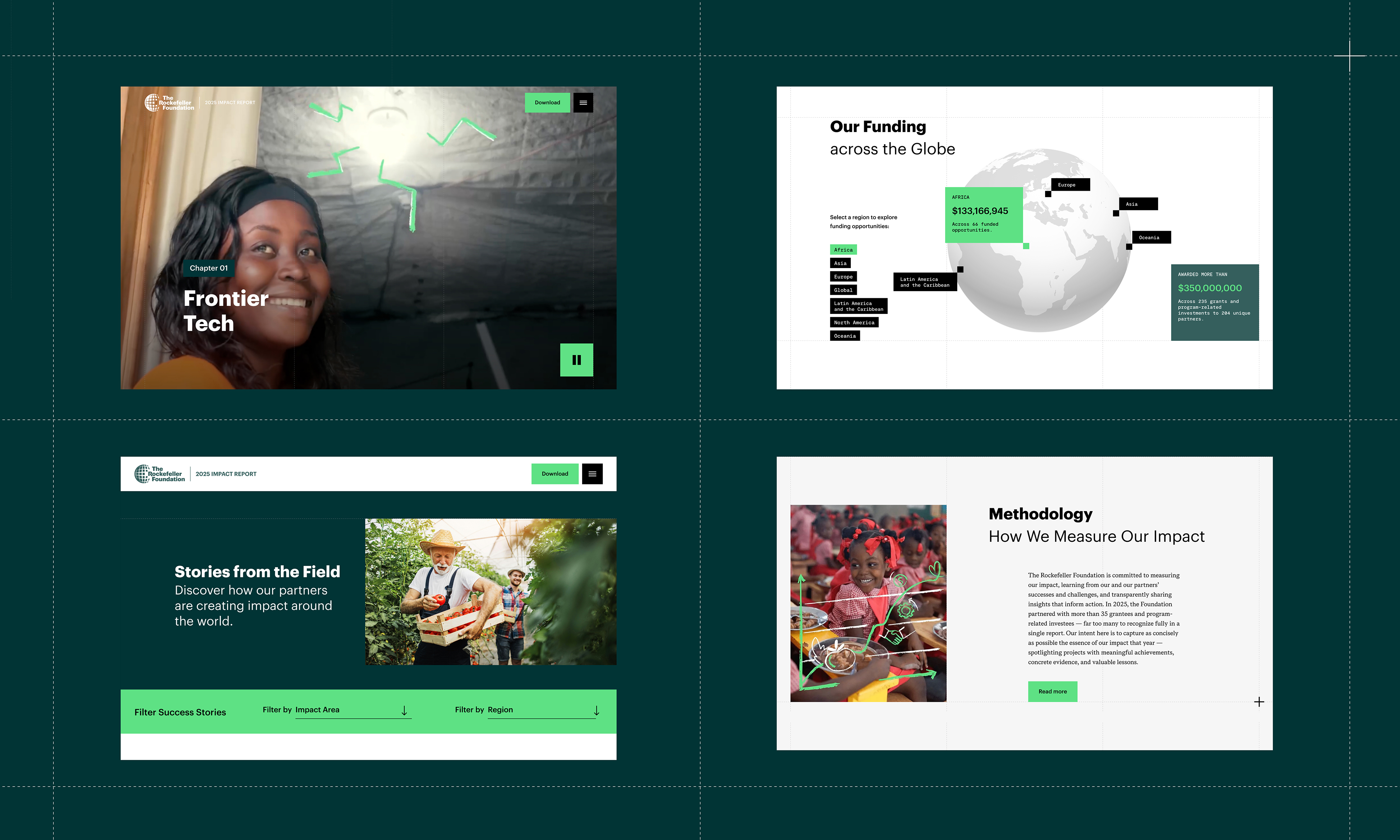
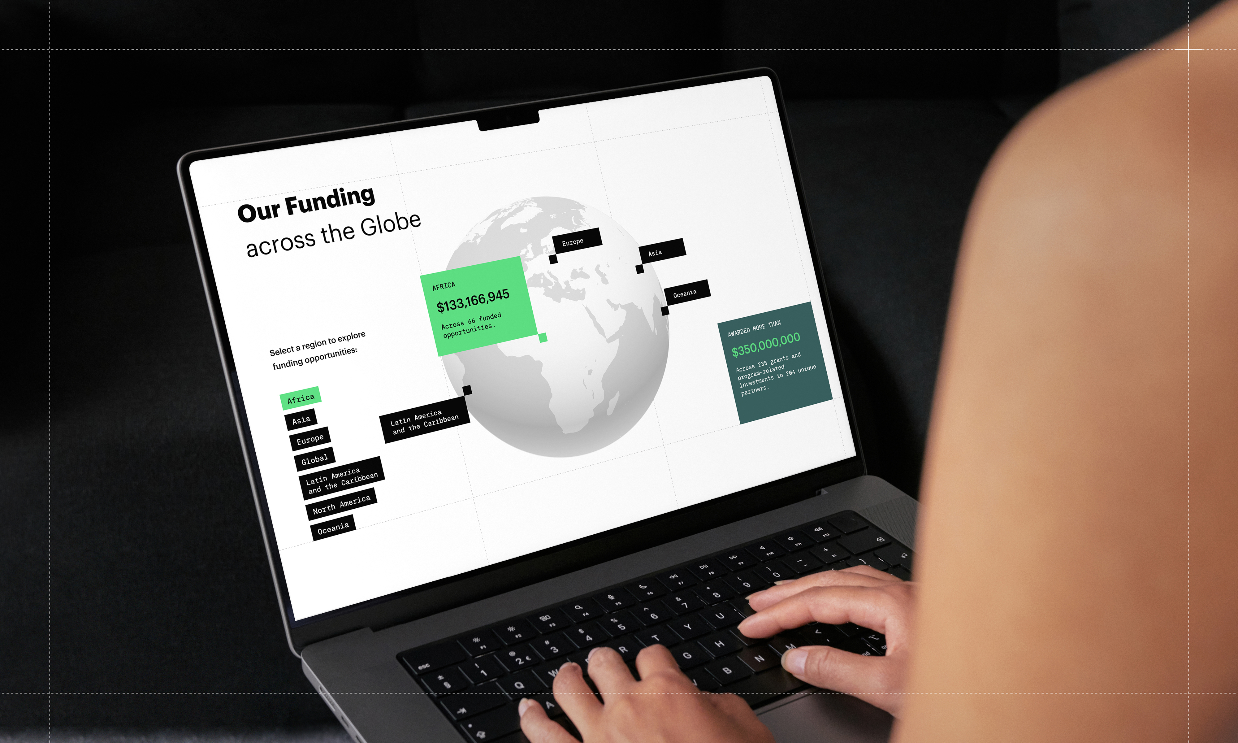
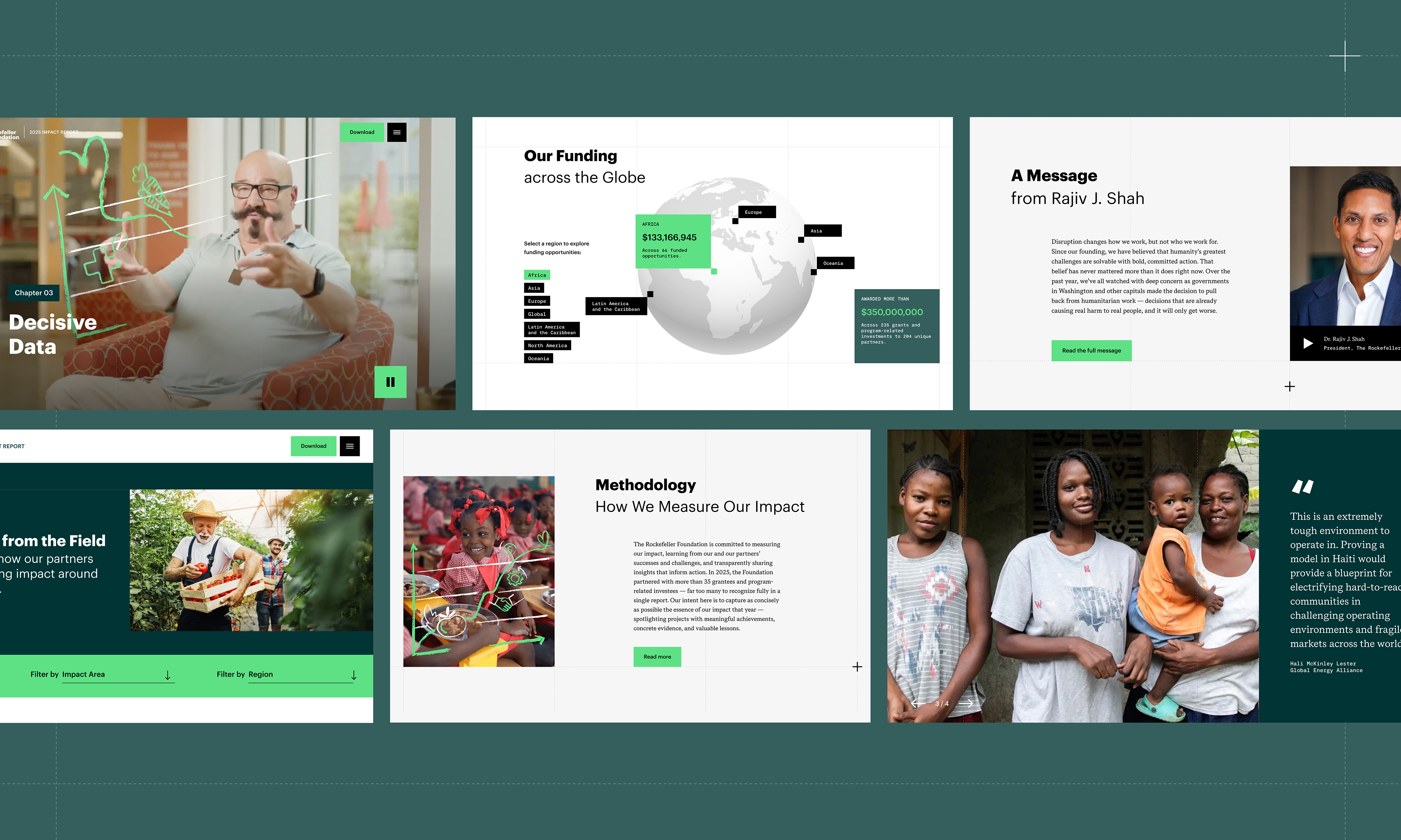
From there, the execution combined editorial design with interactive storytelling. In the opening experience, we used a zoom-in effect as both a visual device and a conceptual framework: the report begins with a global overview, then moves closer into the people, places, and projects behind the numbers. Documentary-style videos introduce the three chapters, while custom animated illustrations add warmth and immediately identify the changemakers at the center of the work. Early in the journey, an interactive funding globe shifts the perspective back out again, allowing users to browse by region and understand the breadth of the Foundation’s impact.
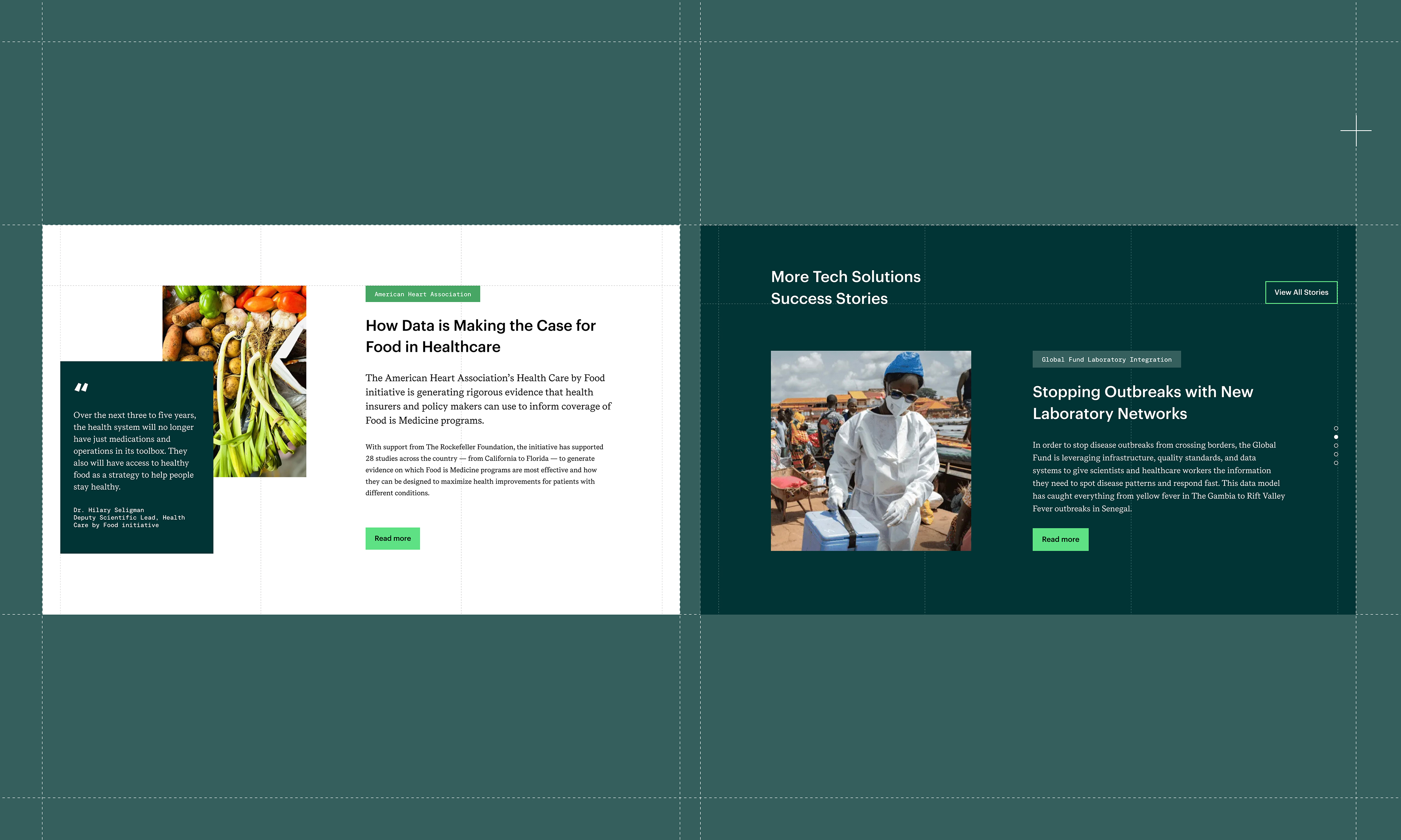
Key stories were then developed as immersive features, supported by photography, illustration, video, motion, and data points that help users quickly understand both the human stakes and the measurable outcomes. Illustration played an important role in making the report feel warmer and more approachable, adding clarity and optimism without simplifying the complexity of the work.
Data visualization was treated as a storytelling tool, not a decorative layer. The “By the Numbers” section gives users a clear view of the Foundation’s impact across people, planet, and capital, while the regional explorer shows the work's global reach. These elements support users who need quick proof points while still allowing deeper exploration for those who want context.
The design system was created to feel modern, credible, and flexible. Motion and micro-interactions guided attention, created pacing, and leveraged the digital format. Video expanded the report's emotional range and brought the work closer to the people and communities it affects.
A key challenge was balancing depth with usability. The report needed to be comprehensive enough for expert audiences, but accessible enough for users arriving with limited time or context. We addressed this through clear navigation, modular content, strong chaptering, scannable impact metrics, story-led entry points, and multiple pathways into the material.
The result is a first-of-its-kind digital report for the Foundation: one that transforms a reporting requirement into an engaging platform for transparency, storytelling, and leadership.
The report successfully turned The Rockefeller Foundation’s 2025 impact into a clear, accessible, and shareable digital experience. Instead of a static publication, it gave users multiple ways to understand the Foundation’s role in driving measurable change through data, systems, partnerships, and delivery.
The experience translated major results into a format that is easier to navigate and remember: $350M+ awarded across 235 grants and PRIs to 204 partners; 731M end-users reached; $3B directly and $29B indirectly mobilized; 84M tonnes of CO₂e reduced, avoided, or sequestered; and 23M hectares protected or restored.
Just as importantly, the report connected those numbers to real people and real systems. Through interactive chapters, video, illustration, data visualization, and human-centered stories, users could see how the Foundation’s work comes to life across food, energy, health, jobs, and climate.
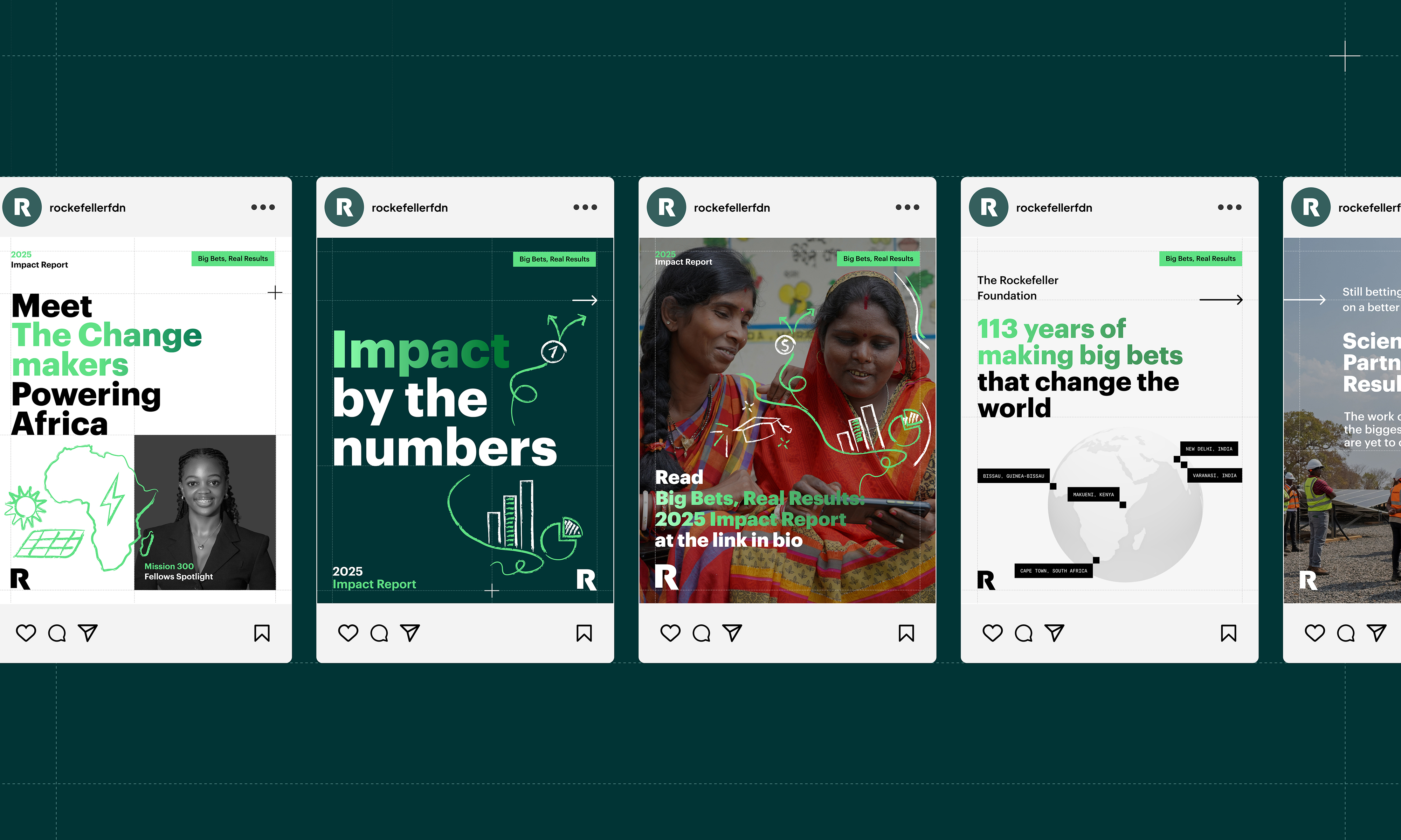
The launch extended beyond the site through a social campaign for staff and partner networks, with LinkedIn-ready copy and shareable graphics that helped the report reach a broader audience. It also gained public visibility through the Foundation’s launch announcement and earned media coverage.
The effort was a success because it reflected the Foundation’s leadership, helped key audiences find what mattered to them, and made a complex year of global work clearer, more compelling, and easier to share.